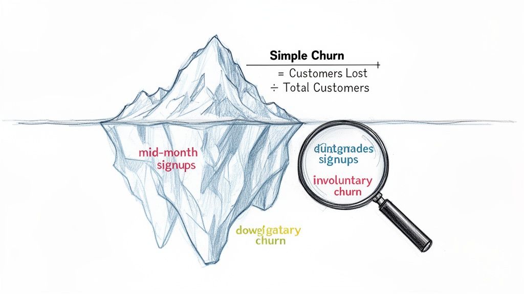
On the surface, calculating churn seems straightforward: just divide the number of customers you lost by the number you started with. Simple, right? But if that's all you're doing, you're getting a dangerously incomplete picture of your business's health.
Relying on that basic formula is like judging an iceberg by its tip—you're completely missing the massive, business-sinking risks lurking just beneath the surface.
Why Your Simple Churn Formula Is Hiding The Truth
If your go-to formula is just (Customers Lost ÷ Total Customers), you’re flying blind. It's a vanity metric that feels productive but tells you almost nothing actionable. This oversimplified view can lead to a false sense of security, masking critical details and pushing you toward poor strategic decisions.
The biggest flaw? This approach treats every single customer as equal, and in SaaS, they never are.
Losing a small startup on a $29/month plan has a vastly different financial impact than losing an enterprise client paying $2,900/month. Yet, the simple formula sees both as just "one" lost customer, completely hiding a potential revenue hemorrhage.
The Nuances Simple Formulas Ignore
A healthy subscription business is defined by its nuances, and a superficial churn rate fails to capture them. When you start digging deeper, a more complex—and truthful—narrative about your customer base emerges.
Here are a few key things your basic churn rate glosses over:
- Mid-Period Signups: New customers who join during the month can artificially inflate your total customer count, making your churn rate appear lower than it really is. It’s a common mistake that can make you feel good but masks the real leaky bucket.
- Revenue Impact: As we just covered, it completely ignores the monetary value of each lost account. This is precisely why MRR churn (Monthly Recurring Revenue churn) is a far more powerful metric for understanding your financial stability.
- Downgrades and Contraction: What about a customer who downgrades from a premium plan to a basic one? They haven't technically churned, but you've still lost recurring revenue. This "contraction MRR" is an invisible threat the simple formula can't see.
The real story of churn isn't just about how many customers leave; it's about who leaves, how much revenue walks out the door with them, and why it's happening.
Voluntary vs. Involuntary Churn
Another critical distinction is the why behind the churn. It almost always falls into two buckets: voluntary and involuntary.
Voluntary churn is when a customer actively decides to cancel their subscription. This is the churn you typically think of, driven by things like product dissatisfaction, pricing issues, or a competitor luring them away.
On the other hand, involuntary churn is passive. It happens because of a failed payment, usually from an expired credit card, insufficient funds, or a bank block. For many SaaS businesses, this can account for a staggering 20-30% of total churn—but the good news is, it's often much easier to recover.
A simple churn formula completely misses the opportunity that comes from implementing proactive customer service strategies to win back these accounts. Understanding this split is the first step toward building a more accurate picture of your customer retention, a concept we explore further in our guide on the retention ratio formula.
Common Churn Metrics At A Glance
To get a true handle on churn, you need to look beyond a single number. Here’s a quick summary of the essential churn metrics every SaaS founder should understand.
| Metric | What It Measures | Why It's Critical |
|---|---|---|
| Customer Churn Rate | The percentage of customers who cancel their subscription in a given period. | Good for a high-level view of customer stickiness, especially for businesses with uniform pricing. |
| Gross MRR Churn Rate | The percentage of monthly recurring revenue lost from cancellations and downgrades. | Provides a raw look at revenue loss before accounting for any expansion revenue. |
| Net MRR Churn Rate | The percentage of MRR lost after factoring in expansion and upgrade revenue from existing customers. | This is the "holy grail" churn metric. If it’s negative, your business is growing from its existing customer base alone. |
| Involuntary Churn | Churn caused by payment failures (e.g., expired credit cards). | Highlights "accidental" churn that can often be recovered with better dunning management. |
Each of these metrics tells a different part of the story. Looking at them together gives you a much clearer, more actionable understanding of your business's health.
Getting Customer Churn Calculations Right
If you're only using a basic formula to track churn, you might be getting a skewed picture of your business's health. It’s a common starting point, but the truth is, simple calculations can be misleading. Why? Because signing up a bunch of new customers can artificially inflate the total customer count in your denominator, making your churn rate look lower than it actually is.
To get a real handle on "logo churn"—the rate at which you're losing actual customer accounts—you need a formula that isn't thrown off by the normal ebb and flow of business. You want a stable, reliable metric you can trust month after month.
The best way to do this is surprisingly simple. You can plug this right into any spreadsheet.
Customer Churn Rate = Churned Customers / ((Customers at Start + Customers at End) / 2)
See what's happening there? Instead of just using the starting number of customers, this formula uses the average number of customers you had throughout the period. By averaging the start and end counts, you smooth out the distortion from rapid growth (or decline). It’s a small tweak that makes a huge difference in accuracy.
Let's See The Churn Formula In Action
Okay, let's make this tangible. Imagine we're looking at the numbers for your SaaS business for the month of April.
Here’s what our data looks like:
- Customers at the start of April: 1,000
- New customers acquired in April: 150
- Customers lost (churned) in April: 50
- Customers at the end of April: 1,100 (which is just 1,000 + 150 - 50)
First thing's first, we need that average customer count for the month. This will be our denominator.
Average Customers = (1,000 + 1,100) / 2 = 1,050
Now that we have our stable denominator, we can pop it into our churn formula.
Customer Churn Rate = 50 / 1,050 = 0.0476
To make that a percentage, we just multiply by 100.
Monthly Customer Churn Rate = 4.76%
That 4.76% gives you a much clearer, more honest view of what happened in April. It correctly factors in that your customer base was actually growing and measures churn against the average number of customers you were serving all month long.
Monthly vs. Quarterly: Picking Your Time Frame
Once you’ve locked in a solid formula, the next question is how often to run the numbers. For most SaaS companies, it boils down to a choice between monthly and quarterly calculations. Each gives you a different lens through which to view your business.
Monthly Churn Rate: This is your early-warning system. Calculating churn every month gives your team the agility to react fast. You can spot a sudden spike and immediately try to connect it to a recent event—a buggy product release, a price hike, or maybe a competitor's big marketing push.
Quarterly Churn Rate: Looking at churn on a quarterly basis helps you see the forest for the trees. It smooths out the inevitable monthly blips. A single rough month, maybe due to a holiday slowdown, won't send everyone into a panic. This big-picture view is far more useful for strategic planning and board-level conversations where you need to show sustained trends.
The golden rule here is consistency. Whatever you choose, stick to it. Comparing January's monthly churn to a Q2 quarterly churn is like comparing apples and oranges—it renders the data useless.
What do most successful teams do? They track churn monthly for internal, operational purposes and report on it quarterly or annually for a more stable, strategic overview. This dual cadence gives you the best of both worlds: you can put out fires quickly while still keeping your eyes on long-term growth and retention.
Measuring Revenue Health With MRR Churn
While customer churn tells you how many logos you've lost, it doesn't tell the whole story. Let's be real: losing a startup on a $29/month plan just doesn't hit the same as an enterprise client walking away from their $499/month contract.
This is exactly why Monthly Recurring Revenue (MRR) churn is one of the most honest metrics for any SaaS business. It shifts the focus from the count of customers leaving to the actual dollar value walking out the door. It’s a gut check that reveals your company's true financial momentum.
Ultimately, churn is a constant drag on your growth. Keeping a close eye on the revenue impact is the only way to build a sustainable business.
Calculating Gross MRR Churn Rate
The most straightforward place to start is with Gross MRR Churn. Think of this as the raw, unfiltered look at the total recurring revenue you lost in a given month. It includes revenue lost from full cancellations and from customers who downgrade to a cheaper plan (often called contraction MRR).
The formula couldn't be simpler:
Gross MRR Churn Rate = (Churned MRR / Starting MRR) x 100
Let's use a fictional SaaS company, "SyncUp," as an example for June.
- Starting MRR on June 1st: $50,000
- MRR from Cancellations: $2,500
- MRR from Downgrades: $500
First, add up all the lost revenue to find the total Churned MRR.
Churned MRR = $2,500 + $500 = $3,000
Now, you just plug that into the formula.
Gross MRR Churn Rate = ($3,000 / $50,000) x 100 = 6%
So, SyncUp’s Gross MRR Churn for June is 6%. This number represents your baseline revenue leak—it’s how much of your revenue engine is sputtering out before you account for any growth. If you want to dive deeper into how this recurring revenue is different from one-time payments, understanding the difference between revenue vs bookings for SaaS businesses is essential.
Calculating Net MRR Churn Rate
Gross churn is a critical health metric, but it only shows one side of the coin. What about the existing customers who are upgrading their plans or adding more seats? That growth, known as Expansion MRR, directly offsets the revenue you're losing.
This is where Net MRR Churn comes into play. It gives you a complete picture by factoring in the positive momentum from your happiest customers.
The formula is a total game-changer for understanding your real growth trajectory:
Net MRR Churn Rate = ((Churned MRR - Expansion MRR) / Starting MRR) x 100
Let’s go back to our SyncUp example. We already know their Churned MRR is $3,000. But during June, they also saw some healthy growth from their current user base.
- Expansion MRR (Upgrades & Add-ons): $4,000
Now we can calculate the Net MRR Churn.
Net MRR Churn Rate = (($3,000 - $4,000) / $50,000) x 100
Net MRR Churn Rate = (-$1,000 / $50,000) x 100 = -2%
SyncUp has a Net MRR Churn Rate of -2%.
This is what every SaaS founder dreams of. A negative Net MRR Churn Rate means you are growing revenue from your existing customers alone—without signing a single new one. It’s a powerful sign of a sticky product and incredible customer loyalty.
The Power of Negative Churn
Let’s put it all together. SyncUp might have lost 10 out of 500 customers, giving them a 2% logo churn. But at the same time, their Net MRR Churn is -2%.
What does this tell us?
- The customers leaving were likely on lower-priced plans.
- The customers who stayed aren't just staying—they're upgrading, expanding, and spending more money.
This is the ultimate signal that your product is delivering so much value that your core users are willing to invest more in it over time. When you achieve negative net churn, you fundamentally change your company's growth model. Your existing customer base becomes its own self-sustaining growth engine.
Segmenting Your Churn Rate For Actionable Insights
Looking at a single, blended churn rate for your entire business is a classic rookie mistake. It’s a vanity metric. Sure, it gives you one number to obsess over, but it hides the crucial details you need to actually make smart decisions. The real magic happens when you start segmenting—breaking down that big number to see how different groups of customers really behave.
When you calculate churn for specific customer groups, a much clearer picture emerges. Suddenly, you might realize that the scary-high churn rate you’ve been losing sleep over is almost entirely isolated to a single, low-tier plan. At the same time, another segment might be incredibly loyal. This is where you find your leverage to improve retention.
Key Segments to Analyze
Every SaaS business is different, but I’ve found that a few segmentation strategies consistently deliver powerful insights. If you’re just starting, calculate churn for these groups to uncover the stories hiding in your data.
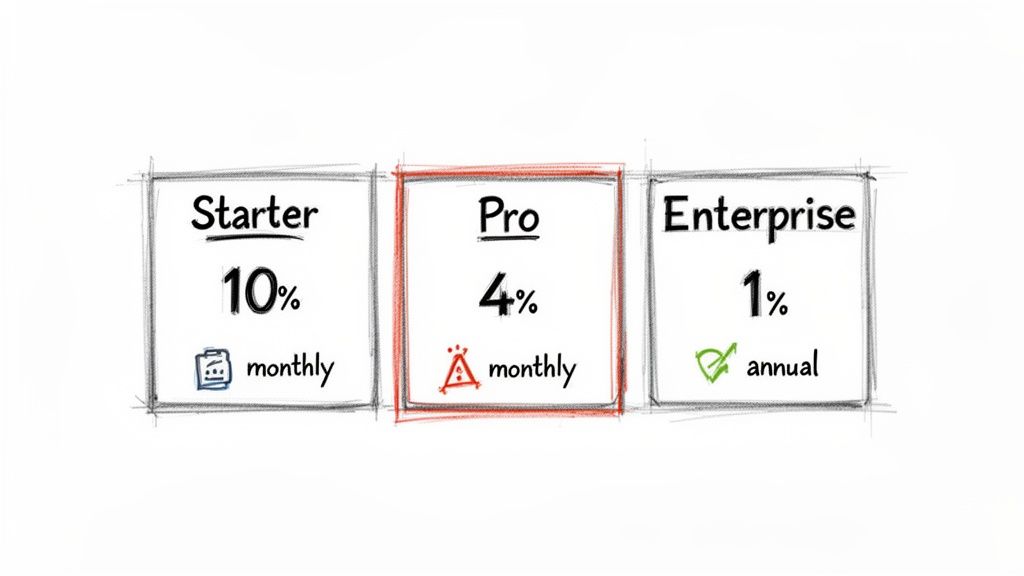
By Plan Type: This is the most common starting point and often the most revealing. You might find your $19/month "Starter" plan has a 10% monthly churn, while your $299/month "Pro" plan churns at a much healthier 2%. This immediately tells you where to focus retention efforts for the biggest revenue impact.
By Contract Term: How do customers on monthly plans stack up against those on annual contracts? In my experience, annual customers almost always have a drastically lower churn rate. They're more committed from day one. If you see high churn among your monthly users, it could be a red flag for a clunky onboarding process or a failure to demonstrate value in those critical first few weeks.
By Acquisition Channel: Do customers who find you through organic search stick around longer than those you acquired via paid ads? Answering this question is a game-changer for your marketing spend. It helps you double down on the channels that bring in high-LTV customers, not just quick signups.
Why Segmentation Drives Action
Calculating churn by segment moves you from simply knowing your churn rate to understanding it. A single number like "5% monthly churn" is just a symptom. Segmented data is the diagnosis.
For example, finding high churn among your self-serve, monthly customers tells you exactly where to hunt for problems. Is your onboarding flow confusing? Does the product's core value not resonate with that specific audience? This focus lets you deploy targeted fixes, like improving in-app tutorials or sending more educational emails during their first 30 days.
A blended churn rate tells you that you have a leak. A segmented churn rate tells you where the leak is and gives you the tools to start plugging it.
The way you break down churn explains why two SaaS companies with the same headline number can have wildly different futures. Enterprise SaaS companies, for instance, frequently hit an impressive 1–2% annual churn. Meanwhile, products focused on SMBs often sit closer to 3–5% annual churn—a huge difference in customer lifetime value.
Automating Segmentation for Real-Time Insights
You can absolutely start by calculating churn for multiple segments in a spreadsheet. But let's be honest, it's slow, tedious, and prone to human error. To make segmentation truly actionable, you need to plug directly into your payment and subscription data.
Modern churn prevention platforms can automate this entire process for you. By integrating with systems like Stripe, they can instantly surface at-risk segments by analyzing subscription statuses, plan metadata, and even product usage patterns.
This gives you a live dashboard showing which customer groups are churning and why. Instead of waiting for a month-end report, you can spot a negative trend in a specific segment—like users on your "Growth" plan who signed up in the last 90 days—and step in before the problem gets worse.
Once you’ve accurately calculated and segmented your churn rate, the next step is putting that knowledge to work. For a deeper dive, check out these actionable churn reduction strategies. This is how you transform your data from a historical report into a forward-looking tool for protecting revenue and driving real growth.
Using Cohort Analysis To Understand Long-Term Retention
Your monthly churn rate is a useful health check, but it's just a snapshot. It tells you what happened last month, but it doesn’t tell you why or if things are actually getting better over the long haul.
Are those product improvements you shipped last quarter actually making your service stickier? Did that new onboarding flow really help customers find value faster? To get answers, you need to go deeper than a single, blended churn metric. This is where cohort analysis comes in.
A cohort is simply a group of customers who share a common characteristic. For tracking churn, the most powerful way to group them is by their signup date. For instance, everyone who joined in January becomes the "January Cohort," everyone from February is the "February Cohort," and you get the picture.
By tracking each cohort's journey separately, you can finally see how retention evolves over a customer’s entire lifecycle. It cuts through the noise of monthly numbers and shows you if your business is genuinely getting better at keeping customers around.
Building a Customer Cohort Retention Table
Don't let the term "cohort analysis" intimidate you; you can build a basic version right in a spreadsheet. The goal is to track the percentage of an initial group of customers that remains active in the following months.
Let's look at a simple example tracking a single cohort—everyone who signed up in January. We start with the total number of customers from that month and then check how many are still active each month after.
Here's what that data might look like:
Sample Customer Cohort Retention Table (January Signup Cohort)
| Month | Active Customers | Retention Rate |
|---|---|---|
| January (Signup) | 200 | 100% |
| February | 180 | 90% |
| March | 164 | 82% |
| April | 150 | 75% |
This table clearly shows the retention decay for the January cohort. You can see that by the end of April, 75% of the original 200 customers were still active.
To make this truly powerful, you'd create a new table like this for each month's signup cohort (February, March, April, etc.) and then compare their performance side-by-side.
How to Read the Story in the Numbers
Once you have data for multiple cohorts, the real insights begin to emerge. You can read the data in two key directions to uncover different stories.
Read Horizontally (Across a Row): This shows you a single cohort's retention over time. How quickly does the January cohort drop off compared to the March cohort? This tells you about the typical customer lifecycle for users who joined at a specific time.
Read Vertically or Diagonally (Down a Column): This is where the magic happens. By comparing the "Month 2" retention rate across different cohorts, you're comparing apples to apples. You can see if customers who joined in March were more likely to stick around for their second month than those who joined in January.
This trend—comparing newer cohorts to older ones at the same stage of their lifecycle—is the single most important indicator of whether your retention efforts are working. If your newer cohorts consistently perform better, you're on the right track.
Imagine your March cohort shows 91% retention in its second month, while the January cohort only had 82%. That's a huge win! It’s solid evidence that something you changed—maybe a product update or a new customer success initiative—had a real, positive impact on keeping new users engaged.
For a more detailed walkthrough, our complete guide on what is cohort analysis breaks down the methodology step-by-step.
What Cohort Analysis Reveals About Your Business
Calculating churn this way shifts your perspective from reactive to proactive. Instead of just measuring last month's damage, you can start connecting your actions to direct outcomes.
Suddenly, you can answer critical questions with data:
- Product Changes: We shipped that major feature in April. Are the May and June cohorts retaining better than the March cohort did in their first few months?
- Onboarding Flows: After we redesigned user onboarding in February, did the February cohort show stronger early-life retention than the January cohort?
- Marketing Channels: Do customers who come from Google Ads churn faster than those who find us through organic search? (This involves segmenting cohorts by acquisition source instead of just time).
This method helps you prove the ROI of your work. When you can draw a clear line from a specific action to improved cohort performance, you can confidently invest more in what works and rethink what doesn't. It’s the best way to know if you're truly building a product that customers value for the long term.
Common Questions About Calculating Churn
When you start digging into churn rate, you quickly realize the formulas are the easy part. The real headaches come from the details—the day-to-day questions that pop up when you're trying to make sense of your own data. Let's walk through some of the most common hurdles I see SaaS founders grapple with.
What Is a Good SaaS Churn Rate?
This is the million-dollar question, and the honest answer is: it depends entirely on who you're selling to. A "good" churn rate isn't a single number; it's a benchmark that shifts based on your customer segment.
- Selling to SMBs? If your customers are small and medium-sized businesses, a monthly customer churn of 3-5% is a pretty standard benchmark. It’s not great, but it’s manageable.
- Selling to Enterprise? If you're dealing with large enterprise clients on annual contracts, the bar is much, much higher. Your monthly churn should be well below 1%.
But let's be clear: the ultimate goal for any SaaS business, regardless of who you sell to, is to hit negative net MRR churn. That’s the promised land. It’s when the new revenue from your existing customers (think upgrades and add-ons) outpaces the revenue you lose from those who cancel or downgrade.
Should I Calculate Churn Monthly or Annually?
You need both. They tell you different things, and you need both perspectives to run your business effectively.
Calculating churn monthly is like having an early-warning system. It’s your operational pulse-check. Did churn suddenly spike after that big feature release last week? Your monthly number will sound the alarm immediately, letting you react fast.
Annual rates give you the bigger picture. They smooth out the monthly bumps and provide a stable, long-term view of your company’s health. This is the metric you’ll share with your board or investors because it’s less about short-term noise and more about fundamental business trajectory.
The most important thing here is consistency. Always compare apples to apples—monthly to monthly, and annual to annual. If you start mixing time frames, your data will become a meaningless mess.
How Should I Handle Downgrades and Upgrades?
This is a critical distinction that trips people up all the time: downgrades and upgrades have nothing to do with customer churn. They are purely a measure of MRR churn.
Think about it. A customer who moves from a $100/month plan down to a $20/month plan hasn't left you. You still have them as a customer. But you have lost $80 in monthly recurring revenue. That loss is what we call contraction MRR, and it gets factored into your gross MRR churn.
On the flip side, an upgrade is expansion MRR, and it actively fights against churn. This is exactly why Net MRR Churn is such a powerful metric—it tells the full story by balancing all these revenue movements within your existing customer base.
Does Involuntary Churn Really Matter That Much?
Oh, absolutely. Ignoring it is one of the most expensive and easily avoidable mistakes you can make.
Involuntary churn—the kind caused by a failed payment, an expired credit card, or a bank issue—can quietly account for 20-40% of your total churn. That's a huge, self-inflicted wound.
The good news is that this is often the lowest-hanging fruit for retention. Basic dunning management, like sending automated payment reminders or simple prompts to update an expired card, can have an incredible ROI. You're literally plugging a hole that money is falling out of.
At LowChurn, we automate churn prediction and prevention so you can focus on growth. Our AI-powered platform connects to your Stripe data in seconds, identifying at-risk customers and providing the tools to save them before they cancel. Stop guessing and start protecting your MRR today. Learn how LowChurn can reduce your churn rate.