
Ever wonder why your overall user numbers look good, but you still feel like you're losing customers? The answer might be hidden in how you're looking at your data. Cohort analysis is a powerful way to stop looking at your user base as one giant, anonymous crowd and start seeing the distinct groups within it.
At its core, cohort analysis groups users together based on a shared characteristic—most often, when they first signed up. From there, you track that specific group's behavior over time. This simple shift in perspective lets you spot trends in retention, engagement, and churn that are completely invisible when everyone is lumped together.
Understanding the Foundations of Cohort Analysis
Think of it this way: your user base is like a high school. If you just measure the performance of the entire student body, you get a blurry, averaged-out picture. But what if you look at each graduating class individually—the Class of 2022, 2023, and 2024? Suddenly, you can see how each group performed year-over-year, comparing them against each other.
That's exactly what cohort analysis does for your SaaS business. It prevents you from mixing the behavior of a loyal customer who’s been with you for five years with someone who just signed up yesterday. This separation is crucial for getting an honest look at your company's health.
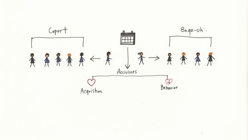
The Core Components
To really get a handle on cohort analysis, you just need to understand its three main building blocks. Every analysis, no matter how complex, comes back to these fundamentals.
Let's break them down in a table.
| Component | Description | Example |
|---|---|---|
| The Cohort | This is the specific group of users you're tracking, defined by a shared trait. | All users who signed up during the third week of January. |
| Acquisition Event | The specific action or trigger that assigns a user to a cohort. | A new user completing the sign-up form or launching the app for the first time. |
| The Behavior | The key metric or activity you are measuring over time to see how the cohort is performing. | User retention rate, churn rate, or average revenue per user (ARPU). |
These components work together to give you a clear, time-based view of user behavior.
By looking backward at what actually happened with specific groups, cohort analysis gives you the descriptive insights needed for more advanced Predictive, Descriptive, and Prescriptive Analytics. Once you understand the past, you're in a much better position to forecast what might happen next.
By isolating user groups, cohort analysis allows you to move beyond vanity metrics like "total active users" and ask much smarter questions. For example, you can determine if a product update in March actually improved long-term retention for users who signed up that month compared to those from February.
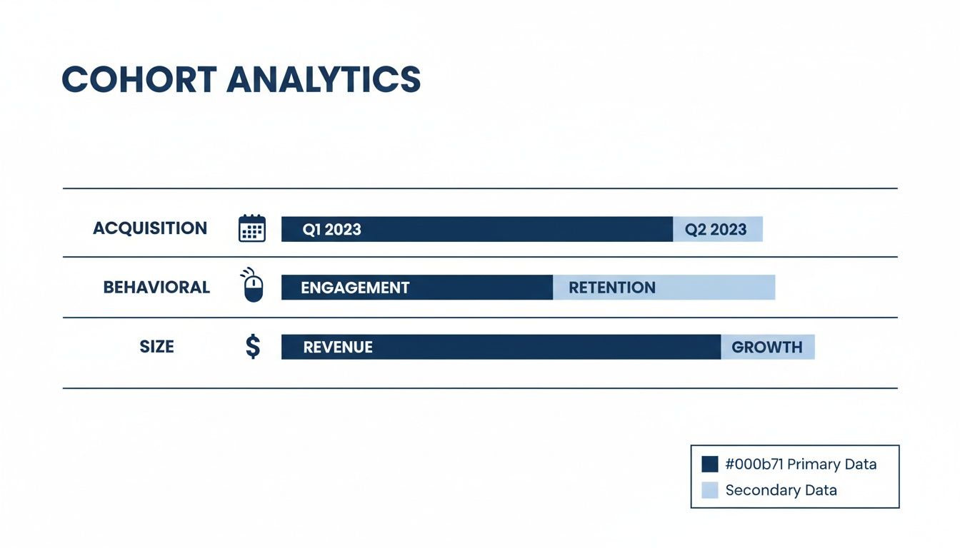
The Different Types of Cohorts You Can Track
Knowing what cohort analysis is gets you in the door. But the real magic happens when you start picking the right groups to track. The type of cohort you build should always be driven by the question you're trying to answer. Are you wondering if a specific marketing channel brings in more loyal users? Or trying to pinpoint which in-app action turns a free trial user into a paying customer?
Different questions demand different ways of slicing your user base. The sharpest analyses go way beyond just grouping users by sign-up date, letting you zero in on the specific behaviors and traits that actually move the needle on growth. That’s why most teams end up running at least a couple of different cohort analyses to get a complete picture of what's happening.
Acquisition Cohorts
This is the classic, the one everyone starts with. Acquisition cohorts group users based on when they signed up. You can group them by the day, week, or month they joined. It’s like looking at your "Class of January" and comparing them to the "Class of February."
This approach is perfect for answering time-based questions, like:
- Did the new onboarding flow we launched in March actually improve retention for that month's new users?
- Do people who sign up during our Black Friday sale stick around longer than users who join any other time?
- Is our overall retention getting better or worse with each new wave of customers?
Acquisition cohorts are your baseline. They give you a clean, simple way to see how time-based changes to your product or marketing affect user loyalty right from the very beginning.
Behavioral Cohorts
While acquisition cohorts tell you when users joined, behavioral cohorts tell you what they did. Here, you group users based on actions they took—or didn't take—within a specific window of time. This is where you really start to connect the dots between user activity and long-term value.
For example, you could create a cohort of "users who invited a teammate in their first 3 days" and compare them against "users who didn't." By tracking these two groups over time, you can see with hard data whether that specific action leads to higher retention. Nailing down these key actions is a huge part of effective customer lifecycle management.
A behavioral cohort uncovers your product's "magic moments." If you discover that users who use Feature X in their first session have a 25% higher 30-day retention rate, you know that driving adoption of that feature is critical for growth.
Size Cohorts
Finally, size cohorts group customers by their value or scale. Think subscription tier, company size, or their initial contract value. This type of analysis helps you figure out which customer segments are your most valuable and whether they behave differently than your smaller accounts.
This is especially crucial for B2B SaaS. It’s common for detailed analyses to reveal that enterprise customers contribute 45-65% of total revenue while making up just a tiny fraction of the user base. Discover more insights about these cohort analysis findings on adasight.com. When you segment by size, you can start making smarter decisions about where to invest your product and support resources to protect the cohorts that truly impact your bottom line.
How to Read a Cohort Retention Chart
The main tool you’ll use for cohort analysis is a cohort retention chart, which you'll also hear called a retention table. At first glance, it can look a little intimidating—like a complicated spreadsheet. But it’s actually a surprisingly intuitive way to see user loyalty over time.
Think of it as a report card for your product. It grades you on how well you’re keeping different groups of users engaged long after they sign up.
Each row in the chart tracks a specific cohort, usually grouped by the week or month they joined. The very first column tells you which cohort it is (like "Jan Week 1") and how many users are in it. The columns stretching to the right represent time itself—Day 1, Day 7, Month 3, and so on. The percentages inside the cells are where the story unfolds, showing you exactly how many people from that original group came back during that period.
This chart shows the different ways you can group your users into cohorts.
As you can see, you can define cohorts by when you acquired them, what they do in your product, or even their company size. Each gives you a different lens for understanding their behavior.
Decoding the Rows and Columns
Once you get the hang of it, reading a retention table is simple. You either move across to follow one group’s journey or down to compare different groups at the same lifecycle stage.
Read Horizontally (Across a Row): This tells the story of a single cohort. As you follow a row from left to right, you'll see how that specific group's engagement naturally fades over time. It’s perfect for pinpointing exactly when a group of users who signed up together started to drop off.
Read Vertically (Down a Column): This is how you compare apples to apples. By looking down the "Month 3" column, for instance, you can instantly see if your newest cohorts are sticking around longer than the older ones did three months into their journey.
A key thing to look for is a "diagonal smile"—a strong, dark-colored diagonal running from the top-left to the bottom-right. This pattern is a fantastic sign. It means your overall retention is getting better with each new group of users you bring in, which is a hallmark of a healthy, improving SaaS product.
Spotting Key Patterns and Problems
The real beauty of a cohort chart is how it makes trends jump right off the page.
Did a specific cohort drop off a cliff? That might line up perfectly with a buggy feature you shipped that week. On the flip side, if you see a cohort with amazing retention, maybe they came from a marketing campaign that you need to double down on.
Learning to spot these patterns is the first real step toward improving retention. When you know who is leaving and when, you’re in a much better position to figure out why.
For a closer look at the numbers that power these charts, our guide on churn rate calculation covers the essential formulas. Mastering both the visual chart and the math behind it gives you a clear roadmap to fight churn and build a product that customers love to use.
Putting Cohort Analysis Into Practice
Knowing how to read a cohort chart is a great start, but the real magic happens when you use it to make smarter business decisions. This is where the theory behind cohort analysis becomes a practical, powerful tool for any SaaS company. It helps you diagnose problems and spot opportunities that are completely hidden in your top-line metrics.
By grouping users together, you can finally draw a straight line from specific outcomes—like incredible retention or a sudden spike in churn—to their root causes. This clarity lets you stop guessing and start making data-backed improvements to your product, marketing, and customer success efforts.
Let’s dig into three practical ways you can put cohort analysis to work right now.
Pinpoint Your High-Retention User Groups
One of the most valuable insights you can uncover is identifying which user groups stick around the longest—and then figuring out why. Are your stickiest users all coming from a specific marketing channel? Did they sign up during a particular promotion? Or maybe they all used a key feature, like inviting a teammate, within their first few days?
Once you analyze the common threads connecting your best cohorts, you can start to reverse-engineer their success.
- Marketing Insight: If you discover that users coming from your blog content have 2x the retention of users from paid ads, it’s probably a good time to re-evaluate your budget.
- Product Insight: Maybe you notice that users who create a "project template" in their first three days have way lower churn. That’s a huge signal. Your onboarding should immediately start pushing every new user toward that exact feature.
This kind of analysis turns retention from a vague goal into a repeatable playbook. It shows you exactly which levers to pull to attract and build more of your ideal, long-term customers.
Detect Early Churn Signals
Your overall churn rate can tell you that you have a leak, but it can’t tell you where the hole is. Cohort analysis, on the other hand, pinpoints the precise moment a user’s journey starts to go south. Does engagement consistently nosedive on Day 3? Or does a specific group's retention fall off a cliff right after their first invoice?
By seeing exactly where the drop-off happens, you can step in at the most critical moment. A sharp decline on Day 7, for example, might mean users aren’t finding a feature they need for long-term value. That’s your cue to add a targeted in-app guide or an email tutorial that lands in their inbox on Day 6.
This proactive approach lets you patch leaks in your user lifecycle before they turn into a flood. You can start testing specific interventions—like personalized onboarding flows, feature tutorials, or timely special offers—aimed at the exact moment a cohort is most likely to bail.
Analyze Revenue and Lifetime Value
Let's be honest: not all customers are created equal. Some cohorts might have solid user retention but generate very little revenue. Others might seem small at first but prove to be far more profitable over time. Analyzing revenue cohorts helps you see the true long-term financial worth of different customer groups.
This is absolutely critical for making smart business decisions. For instance, you might find that customers on your "Pro" plan who signed up in Q2 have a much higher lifetime value (LTV) than the "Basic" plan users from that same period, even if their initial retention looked similar.
This kind of insight can directly shape your pricing strategy, your sales team's focus, and the features you decide to build for your most valuable customer segments.
Common Mistakes to Avoid in Your Analysis
You can build a technically perfect cohort chart, but if the underlying data or your interpretation is flawed, you'll end up chasing ghosts. The numbers can easily fool you, leading you to celebrate a fluke as a win or panic over a problem that doesn't exist.
Let's walk through a few common traps I've seen teams fall into time and again. Spotting them early will ensure your strategic decisions are grounded in reality, not wishful thinking.
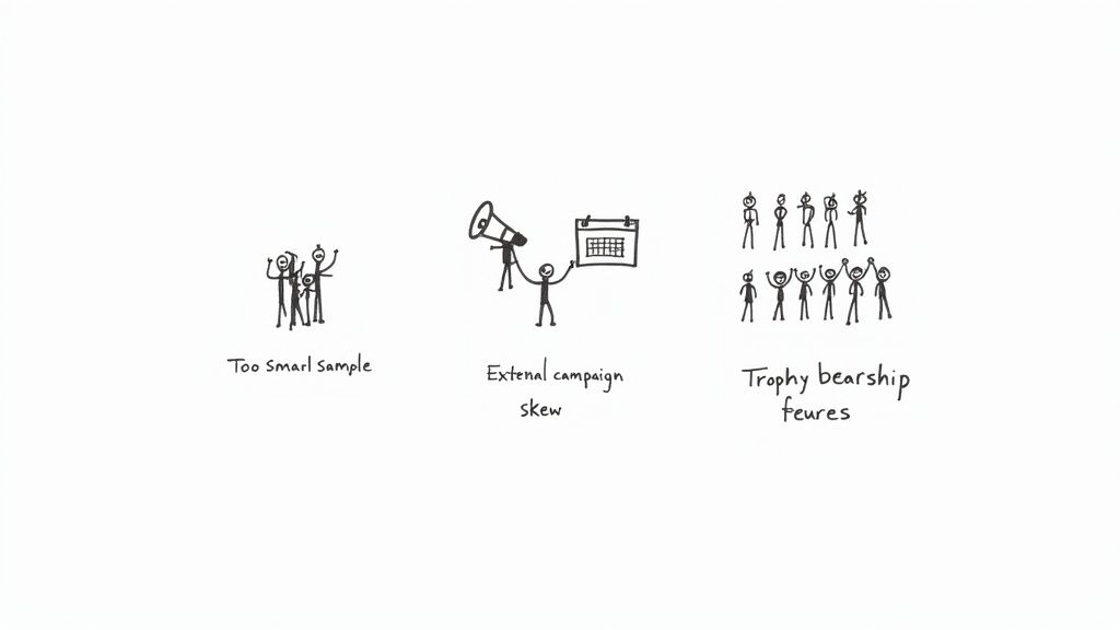
Overlooking Statistical Significance
This is probably the most common mistake: drawing huge conclusions from tiny cohorts. When you’re looking at a group of only 20 users, the actions of just one or two people can send your retention percentages swinging wildly. It’s easy to mistake random noise for a meaningful trend.
Before you get too excited about a number, ask yourself if the cohort is large enough to be credible. There’s no magic number, but a good rule of thumb is if a handful of users leaving or staying can completely flip the story, your sample size is too small to act on.
Ignoring External Factors and Seasonality
Your product doesn't exist in a bubble. A fantastic retention spike in your July cohort might have nothing to do with that new feature you shipped. What if it was actually caused by a viral marketing campaign, a big mention in the press, or just a seasonal uptick common in your industry?
It's a classic mistake to attribute every change in user behavior to something you did inside the product. Always pull up a calendar and cross-reference your cohort trends with marketing campaigns, holidays, industry events, and major product releases. Context is everything.
Focusing Only on Your Survivors
It feels great to study the users who love your product and stick around, but this leads directly to survivorship bias. This is what happens when you analyze the habits of your most successful customers while ignoring the massive group that didn't make it.
You might find that "loyal users love Feature X," but that's a dangerous half-truth. The real insight might be that 90% of the users who churned never even discovered that feature in the first place. To get the full story, you have to dig into what your churned users didn't do. Often, their inaction tells you more than the actions of your power users.
Turning Cohort Insights Into Business Growth
Finding a meaningful trend in a cohort chart feels great, but that's just the starting line. The real magic happens when you close the loop—turning those numbers into tangible actions that actually improve your product and your business. This is where data gets a seat at the strategy table.
Your goal is to shift from just observing to actively experimenting. Let's say you spot a cohort with incredible retention. You dig in and find they all came from a specific marketing campaign. Boom—you now have a clear signal to double down on that channel.
Or maybe a behavioral cohort shows that users who invite a teammate within 24 hours almost never churn. Your next move is obvious: redesign your onboarding to make that exact action the easiest, most rewarding thing a new user can do.
From Data Points to Action Plans
The trick is to move from insights to growth with a clear plan. Instead of just trying random things and hoping for the best, your cohort data lets you form specific, testable ideas that can drive real improvement.
Here are a few ways to put this into practice right away:
- A/B Test Your Onboarding: Pinpoint that "aha!" moment for your best cohorts. Then, design an experiment to get all new users to that key activation event much faster.
- Get Ahead of Churn with Smart Communication: Identify the exact week or month a cohort’s engagement usually starts to dip. You can then proactively send targeted emails or in-app messages with helpful tips just before they hit that wall.
- Let Data Drive Your Roadmap: If cohorts that adopt Feature X have ridiculously high retention, you've found a winner. This gives you a data-backed reason to pour more resources into improving and promoting that feature.
By connecting what users do early on with how long they stick around, cohort analysis gives you a clear roadmap for what to build, who to talk to, and when to step in. It pulls you away from vague, high-level metrics and focuses you on the specific actions that create truly loyal customers.
A big piece of this puzzle is knowing which user groups are the most valuable to begin with. To learn more, check out our guide on how to calculate customer lifetime value.
On top of that, new tools are changing the game. Exploring how AI-Powered Churn Rate Analysis can be layered onto these cohorts will help you get even smarter about retention. At the end of the day, every insight you find should spark a direct, strategic action that builds a stickier product and a much healthier business.
Got Questions? We've Got Answers
As you start wrapping your head around cohort analysis, a few practical questions always seem to pop up. It's one thing to understand the theory, but another to actually put it into practice. Let's tackle some of the most common ones.
What's the Best Tool for the Job?
The best tool really depends on your team's technical skills and how deep you need to go. The good news is, you don't need some expensive, specialized platform to get started.
- Spreadsheets (Google Sheets, Excel): This is where most people begin. If you're comfortable with pivot tables, you can absolutely build a solid cohort analysis manually. It’s perfect for one-off projects or if you're just dipping your toes in the water.
- Business Intelligence Tools (Tableau, Looker): When you're ready to move beyond manual work, BI tools are a huge step up. They can connect right to your data warehouse, letting you build automated, repeatable reports that are always up-to-date.
- Product Analytics Platforms (Amplitude, Mixpanel): These tools are built from the ground up for this kind of work. Creating both acquisition and behavioral cohorts is often as simple as clicking a few buttons, which is a massive time-saver.
How Big Should My Cohorts Be?
Picking the right cohort size is a classic balancing act. If you go too granular with daily cohorts, you might not have enough users in each group for the data to be statistically meaningful. A few random unsubscribes can make a day look like a disaster.
On the other hand, if you go too broad with monthly cohorts, you get a stable, big-picture view, but you might miss the impact of a specific marketing campaign or feature release that happened mid-month.
A great rule of thumb is to start with weekly cohorts. It's often the sweet spot—big enough to be reliable, but small enough to give you actionable detail on what’s happening week-to-week.
How Often Should I Be Looking at This?
Think of it like checking your car's oil. You don't need to do it every day, but you definitely don't want to wait until the engine starts making funny noises.
For most SaaS businesses, running a cohort analysis on a monthly basis is a fantastic rhythm. It gives you enough time to see real trends develop without letting a problem fester for a whole quarter.
The exception? If you just pushed a major new feature or launched a big marketing blitz, you'll want to check in more frequently—maybe even daily or weekly—right after the launch. This is your chance to see the immediate impact and react quickly.
Ready to turn churn signals into retention wins? LowChurn uses AI to predict which customers are at risk, giving you the chance to act before they cancel. See how our automated platform can protect your MRR at https://www.lowchurn.com.