
Churn analysis is simply the process of figuring out how many customers are leaving you over a certain period. But more importantly, it's about digging in to understand why they're leaving. By slicing and dicing your data, you can uncover hidden patterns in user behavior, plan types, and customer profiles that tell the real story. This isn't just an exercise in reporting; it's the bedrock of any solid, data-driven retention strategy.
Why Churn Analysis Is Your Most Critical Task
You can't fix a problem you don't understand. I've seen too many founders get stuck tracking a single, top-line churn metric without ever investigating what’s driving it. That’s like knowing your boat has a hole in it but having no idea where it is or how big it is. A proper churn analysis takes you from just measuring the problem to actually diagnosing it.
Ignoring churn is a recipe for disaster. It leads straight to what people call the Leaky Bucket Syndrome, where you’re pouring new customers in the top, but they're draining out of the bottom just as fast. In the SaaS world, that's a battle you'll never win.
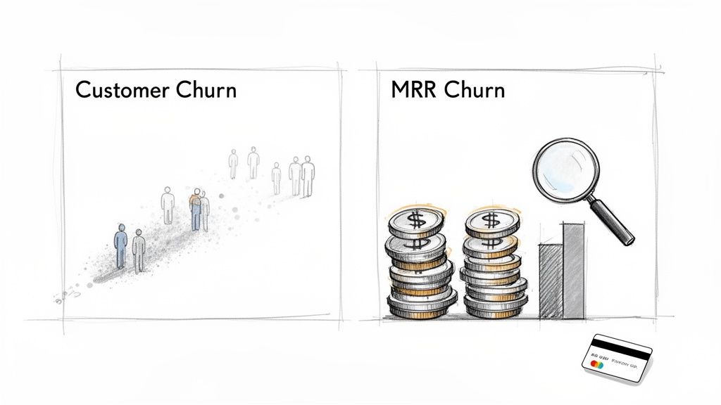
Customer Churn vs. MRR Churn
One of the first mistakes I see people make is obsessing over customer churn (the number of logos lost) while ignoring MRR churn (the dollar value lost). They are both useful, but they tell completely different stories about the health of your business.
- Customer Churn: This is your logo churn—the percentage of individual accounts that cancel. Losing ten small startups on your $20/month plan looks very different than losing a single enterprise client.
- MRR Churn: This tracks the monthly recurring revenue that walks out the door with those canceled accounts. It’s a direct measure of the financial hit to your business.
Losing one enterprise customer paying $5,000/month is a gut punch. Losing ten startups on a $50/month plan? Not nearly as damaging. Focusing on MRR churn helps you direct your energy toward saving your most valuable customers first.
The goal isn't just to keep any customer; it's to keep the right ones. MRR churn points you directly to the cancellations that are actually hurting your growth and need your immediate attention.
Setting a Realistic Benchmark
So, what’s a "good" churn rate? Having some context is key. The average monthly churn rate for B2B companies sits around 6.7%, and for SaaS companies under $10 million in annual profit, the average annual churn is a staggering 20%.
That said, the best-in-class companies often get their monthly rate down closer to 3.5%. The difference between a 20% annual churn and a 3.5% monthly equivalent often separates the businesses that are barely treading water from the ones that are truly scaling. If you want to see how you stack up, digging into the latest customer success statistics is a great place to start.
Getting Your Data House in Order for Churn Analysis
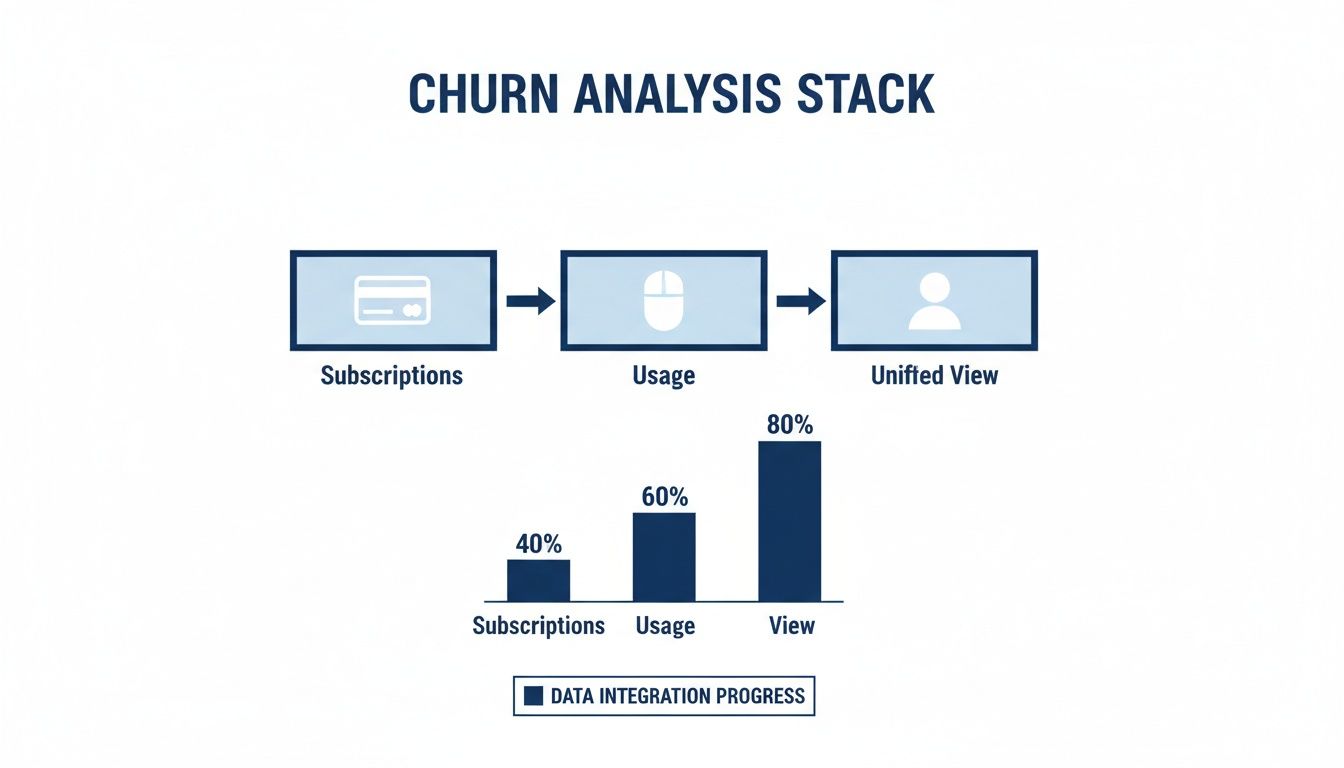
You can't fix what you can't measure. And when it comes to churn, accurate measurement is impossible without clean, connected data. The real insights come when you can see the full picture—linking what customers pay you with how they actually use your product.
Your billing system is the first piece of the puzzle. For most of us in SaaS, that means Stripe. It's the ultimate source of truth for every subscription event: when someone signs up, upgrades, downgrades, and, of course, when they cancel. This is ground zero for any real churn analysis.
The second, equally critical piece is your product usage data. This is the story of what people are doing inside your app. Are they using the features that lead to success? Are they getting value? Without this context, you're flying blind, only finding out a customer was unhappy long after they’ve hit the cancel button.
Connecting the Dots: Subscriptions and Product Usage
The goal is to get these two very different datasets to talk to each other. Your Stripe data tells you when a customer leaves, but your product usage data starts to explain why.
There are a few ways to build this bridge. You could start with a simple JavaScript snippet in your app that tracks key user actions and sends them to a data warehouse or an analytics tool. A more robust approach is to use a Customer Data Platform (CDP), which can centralize all your event tracking and sync that information across your entire tech stack, including your billing platform.
Whatever you choose, the non-negotiable part is this: every event must be tied to a unique customer_id that perfectly matches the ID in your Stripe account. This ID is the golden thread that stitches the entire customer journey together.
Pulling the Right Data from Stripe
First things first, you need the raw materials. Once you have your Stripe data syncing to a database (using a tool like Fivetran or Stitch), you can run some basic SQL to pull the most important subscription details.
Here’s a practical query to get a list of all your active and canceled subscriptions:
SELECT c.id AS customer_id, c.email, s.id AS subscription_id, s.status, p.name AS plan_name, FROM_UNIXTIME(s.start_date) AS start_date, FROM_UNIXTIME(s.canceled_at) AS canceled_at FROM stripe.customers c JOIN stripe.subscriptions s ON c.id = s.customer_id JOIN stripe.plans p ON s.plan_id = p.id WHERE s.status IN ('active', 'canceled');
This simple query gives you a solid foundation. You'll get a clean list showing who the customer is, their subscription status, what plan they're on, and the key dates for their journey.
A word from the wise: Don't just look at the
canceled_attimestamp. Keep a close eye on subscriptions wherecancel_at_period_endis set totrue. These are your "zombie" churners—they've already decided to leave but are still active. This is a prime segment for a last-ditch effort to win them back.
Instrumenting What Really Matters: High-Value Product Events
With your Stripe data flowing, it's time to figure out which in-app actions actually correlate with a customer sticking around for the long haul. These are your "aha moments," the signals that someone is truly getting value from your product.
You need to think about the core, sticky actions a successful user takes. For example:
- Project management tool:
project_created,task_completed,team_member_invited - Social media scheduler:
post_scheduled,account_connected,report_downloaded - Analytics platform:
dashboard_created,custom_event_tracked,integration_enabled
Once you're tracking these events, you can start asking much smarter questions. Do users who invite three or more team members in their first week have a lower churn rate? Do customers who never download a single report churn faster?
This is where the magic happens. Combining this rich behavioral data with your Stripe subscription history is how you move from just reporting on churn to actually predicting it—and building an early warning system to stop it before it's too late.
Uncovering Trends with Cohort and Survival Analysis
A single, company-wide churn number is just a vanity metric. It's a starting point, but it hides the most important stories buried in your data. To get to the truth of customer behavior, you have to move beyond simple averages and start looking at specific groups of users over time.
This is where cohort and survival analysis come in. They’ll transform that blurry, top-level churn rate into a sharp, actionable picture of what’s really going on.
The Power of the Cohort Chart
The first and most powerful tool you’ll use is cohort analysis. Instead of lumping all your customers into one giant bucket, you group them into cohorts based on a shared trait—most often, the month they signed up. This lets you track the retention of each monthly group as they move through their lifecycle with your product.
If you're new to the concept, this guide on what is cohort analysis is a great place to get up to speed.
This single visualization can tell you more than a thousand spreadsheets ever could. Is the cohort from six months ago sticking around longer than the one from last year? If so, that big product update or the new onboarding flow you launched might actually be working. It’s a direct, visual report card on your retention efforts.
From Retention Curves to Customer Half-Life
While cohort analysis shows you if retention is getting better, survival analysis tells you how long a typical customer sticks around before they churn. Think of it as calculating the "half-life" of your customer base. This technique helps you pinpoint a critical answer: At what stage in the customer journey are we most likely to lose people?
This is where your unified data really starts to shine, letting you connect subscription data from a platform like Stripe with actual product usage signals to uncover some powerful trends.
The key insight here is that payment history alone isn't enough. You need the behavioral context from product usage to understand the why behind the churn.
For example, you might discover that customers who don't adopt a specific key feature within their first 30 days have a staggering 75% churn rate by month three. That’s a crystal-clear, actionable signal to focus your onboarding and engagement efforts on that exact feature within that critical timeframe.
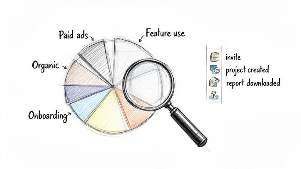
Slicing the Data for Deeper Insights
The real magic happens when you start segmenting. Averages are dangerously misleading, so it's absolutely vital to slice your data to compare different customer groups.
Start by segmenting your cohorts by key attributes:
- Plan Type: Are enterprise customers sticking around longer than those on your starter plan?
- Acquisition Channel: Do users from organic search have a better retention curve than those from paid ads?
- Company Size: Are you losing more SMBs than mid-market companies?
By segmenting your analysis, you move from knowing that you have a churn problem to knowing who has the problem and when it's happening. This precision is what separates reactive reporting from a proactive retention strategy.
Know Where You Stand: Industry Benchmarks
Finally, it's crucial to contextualize your findings against industry benchmarks. Without this context, your numbers are just floating in a vacuum. The table below shows just how much churn rates can vary across different sectors.
SaaS Churn Rate Benchmarks by Industry
| Industry Sector | Average Annual Churn Rate |
|---|---|
| B2B SaaS (Enterprise) | 6% - 10% |
| B2B SaaS (SMB) | 15% - 25% |
| B2C SaaS (Subscription Box) | 8% - 12% |
| B2C SaaS (Media/Streaming) | 12% - 18% |
| FinTech / InsurTech | 10% - 15% |
| EdTech | 7% - 11% |
Understanding where you fit in helps set realistic targets and focus your resources effectively. For example, a SaaS company serving SMBs with a 15% annual churn rate is actually performing quite well for its category. Without knowing the benchmark, that number might seem alarmingly high. Context is everything.
Pinpointing the Root Causes of Customer Churn
Knowing who is churning is only half the story. The real gold is in understanding why. This is where we stop just reporting numbers and start digging into a proper root-cause analysis, turning that raw churn data into an actionable game plan. It’s all about slicing your data in different ways to find the hidden patterns and friction points in your customer journey.
The process starts by segmenting your churned customers into groups that actually mean something. A single, company-wide churn rate won't tell you much. But once you start asking pointed questions, a much clearer picture emerges. For example, are customers who came from paid ads churning faster than those from organic search? The answer could completely reshape your marketing budget and messaging.
Breaking Down Churn by Segment
To get to the heart of the problem, you have to look at churn through several different lenses. The first step is to create segments based on who your customers are, how they use your product, and what they pay for.
Here are a few essential ways I’ve seen teams slice their data effectively:
- Firmographics: Group your customers by company size, industry, or even location. You might discover your product is a killer solution for mid-market tech companies but consistently fails to retain small businesses in the retail space.
- Behavioral Data: This is a big one. Segment users by how they engage with your product. Compare the churn rate of users who completed your onboarding checklist to those who skipped it. Look at how often they log in or whether they’ve adopted that one "sticky" feature you know drives long-term value.
- Subscription Data: Analyze churn based on the plan type, contract length, or how long they’ve been a customer. It's almost always true that monthly plans see higher churn than annual ones, or that entry-level tiers with fewer features have a harder time sticking around.
A proper churn rate analysis isn't a single metric—it's a collection of dozens of smaller, segmented metrics that, when pieced together, reveal the true health of your customer base and point you toward a solution.
Uncovering the Customer Experience Gap
More often than not, these different segments all point back to one powerful driver of churn: a poor customer experience. We’ve moved past the days when price or features were the only things that mattered.
The numbers are pretty stark. A shocking 59% of U.S. customers will ditch a brand after a few bad experiences, and 17% will leave after just one negative interaction. The financial hit is massive, with U.S. businesses losing an estimated $75 billion every year from poor service. You can dig into more of these critical customer retention statistics.
This data reveals a crucial truth for any SaaS team: the window to save a struggling customer is incredibly small.
By identifying exactly which behavioral and firmographic segments are churning, you can pinpoint where your customer experience is failing. This lets you stop guessing and start knowing—the essential first step in building a powerful churn prediction model that can spot at-risk customers before they even think about leaving.
Turning Your Churn Analysis Into Action
All this analysis is great, but a pretty dashboard doesn't save customers. After digging through cohorts, segments, and behavioral data, the only thing that matters is turning those insights into actual retention experiments. This is where your deep dive into the numbers starts to directly save revenue.
Every insight you uncover should lead to a clear hypothesis you can test. For example, if your analysis shows that users who never touch your "reporting" feature churn at a 3x higher rate, you've got a fantastic starting point.
Crafting Retention Plays from Your Findings
A "retention play" is just a fancy term for a targeted experiment designed to fix a specific churn driver. For every play, you need a clear hypothesis, a quick description of what you're going to do, and the key metrics you'll watch to see if it worked.
Let's walk through a few real-world scenarios and the plays you could run right away.
The Churn Driver: Users aren't adopting a critical, "sticky" feature.
- The Hypothesis: If we proactively guide new users to this feature within their first 14 days, we'll increase adoption and cut down their churn in the first 90 days.
- The Experiment: Launch a targeted in-app tour that pops up for new users who haven't used the feature by day seven. Back this up with a two-part educational email sequence showing them exactly how to get value from it.
- How We'll Measure Success: We'll track the feature adoption rate for the test group versus a control group and, most importantly, keep an eye on their 90-day retention rate.
The Churn Driver: People are bailing during onboarding.
- The Hypothesis: Simplifying our onboarding checklist and adding a little gamification will get more people to the finish line and reduce first-month churn.
- The Experiment: Let's A/B test a redesigned onboarding flow. We'll cut the steps from five to three and add a simple progress bar to create momentum.
- How We'll Measure Success: We'll compare the onboarding completion rate and the 30-day churn rate for both versions.
These kinds of experiments close the loop, drawing a straight line from your analysis to saved MRR.
Tackling Preventable Involuntary Churn
One of the quickest wins you can get from any churn analysis is going after involuntary churn. This is the absolute low-hanging fruit of retention, often accounting for a staggering 20-40% of total churn. It has nothing to do with your product's value—it's all about failed payments.
A smart dunning campaign isn't about nagging customers. It's a proactive, automated system designed to recover revenue gracefully by reminding users about payment issues before their subscription is canceled.
Putting an effective strategy in place is surprisingly straightforward:
- Automated Retries: Set up your payment processor to retry failed payments at intelligent intervals.
- Dunning Emails: Create a sequence of 3-5 emails that are sent after a payment fails, gently escalating the urgency with each message.
- Pre-Dunning Notices: Give customers a heads-up 30 days before their credit card on file is about to expire.
Studies have shown that good dunning campaigns can recover up to 70% of failed payments. That’s an immediate boost to your bottom line for relatively little effort.
Building a Proactive Defense with Health Scores
Ultimately, you want to get ahead of the problem. This means shifting from reacting to cancellation emails to predicting which customers are at risk before they've mentally checked out. The best way to do this is with a dynamic customer health score.
A health score rolls multiple data points—like product usage frequency, key feature adoption, support ticket volume, and subscription data—into a single, easy-to-understand metric. To implement effective strategies that impact churn, explore how an omnichannel customer service platform can unify conversations and boost retention by enhancing customer experience.
By building a system that flags accounts when their health score dips below a certain threshold, you create an early-warning system. This gives your team a chance to intervene with targeted support or a helpful check-in, potentially turning a churn risk into a loyal advocate. If you're looking to build your own, our guide on creating a customer health score provides a step-by-step framework.
A Few Common Questions About Churn Rate Analysis
When you first start digging into churn, a lot of questions pop up. It's a topic full of nuance—what's "good" for one business can be a disaster for another, depending on your industry, price point, and who you sell to.
Let's walk through some of the most common questions I hear from founders trying to get a handle on their retention.
So, What’s a Good Churn Rate for a SaaS Business?
The honest answer? It really depends. A 5% monthly churn rate might not sound terrible at first glance, but if you do the math, that means you're losing nearly half of your customers every single year. Context is everything.
Here are some rough benchmarks I've seen in the wild:
- For SaaS serving SMBs: A monthly churn rate somewhere in the 3-7% range is pretty common and often considered a realistic target.
- For Enterprise SaaS: The bar is much higher. You're aiming for something closer to 1-2% monthly. This is usually because of longer-term contracts and the product being deeply embedded in their operations.
But here’s the thing: the best benchmark is your own past performance. If your churn was 6% six months ago and it’s 4.5% today, that’s a win. It shows you're moving in the right direction.
The most important benchmark isn't what your competitor is doing—it's what you were doing last quarter. A consistent downward trend is the real sign of a healthy, improving business. It proves your product and retention efforts are actually working.
How Long Until I See Results from My Efforts?
This one comes down to the types of plays you're running. Some fixes give you a quick hit, while others are a much longer game.
For instance, if you set up a smart dunning campaign to fight involuntary churn from failed payments, you can see a measurable bump in your MRR in the first 30-60 days. It’s a classic quick win.
On the other hand, bigger strategic initiatives—like completely overhauling your user onboarding or building a customer community—take time to bear fruit. You might be looking at several months, or even a full year, before you see a significant, lasting drop in your overall churn numbers. The trick is to track both the short-term gains and the long-term impact.
Customer Churn vs. Revenue Churn: Which One Matters More?
Both are important, but if I had to pick one, I’d focus on revenue churn every time. Why? Because customer churn (sometimes called logo churn) treats every customer as equal, but they rarely are.
Think about it. Losing ten startups on your $49/month plan stings, but it’s not a business-ending event. Losing one enterprise customer paying $10,000/month? That's a code-red emergency.
Revenue churn cuts through the noise and shows you the actual financial damage. It immediately points you to the cancellations that are hurting your growth the most, helping you figure out where to focus your energy first. Looking at both gives you the full story, but revenue churn tells you where the money is.
Stop guessing why customers are leaving. LowChurn uses AI to analyze your Stripe and product data, predicting churn with over 85% accuracy. Get a real-time dashboard with actionable insights and proven retention campaigns in minutes. Protect your MRR with LowChurn today.