When we talk about customer success KPIs, we're really talking about the vital signs of your business. These are the specific metrics that tell you how healthy, happy, and loyal your customers truly are. The big three you can't ignore are Net Revenue Retention (NRR), your Customer Health Score, and, of course, the dreaded Churn Rate.
Why Founders Often Track the Wrong KPIs
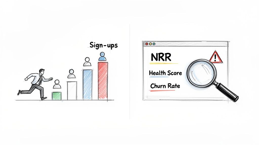
It’s so easy to get caught up in the wrong numbers. I've seen it countless times: SaaS founders get addicted to the thrill of new sign-ups. That rush feels like progress, but focusing solely on acquisition can completely mask a retention crisis brewing just beneath the surface.
This guide is about making a crucial shift—moving from constantly fighting fires to building a proactive, data-driven customer success engine. We’re going to zero in on the KPIs that actually signal a healthy, growing business, not just a busy one.
The Problem with Vanity Metrics
Metrics like total users or page views are tempting because they're simple and often go up. But they don't tell you if your customers are actually getting value from your product. Real, sustainable growth is built on keeping the customers you have, not just replacing them in a never-ending cycle. That means you need to listen to a different set of signals.
The metrics that genuinely matter are:
- Net Revenue Retention (NRR): This is the gold standard. It reveals how much your revenue is growing or shrinking from your existing customer base, factoring in both upgrades and downgrades.
- Customer Health Score: Think of this as a crystal ball. It’s a predictive score that blends signals like product usage and support tickets to flag accounts that are in danger of churning—long before they actually do.
- Churn Rate: The bottom line. This is the percentage of customers or revenue you lose over time. It’s the ultimate, unfiltered verdict on your product's value.
A high churn rate is like trying to fill a leaky bucket. No matter how much water (new customers) you pour in, you’ll never make progress until you plug the holes. Focusing on retention KPIs is how you find and fix those leaks.
Shifting to a Proactive Mindset
In the world of SaaS, churn is the metric that keeps founders up at night. Top-performing teams manage to keep their gross revenue retention (GRR) around 90-95%. That might sound great, but it means even the best companies can lose up to 10% of their monthly recurring revenue.
If your company uses Stripe, you have to account for involuntary churn from failed payments, which can easily add another 2-3% to your churn rate. Suddenly, you're looking at a serious problem.
The good news is that modern tools can turn complex data from platforms like Stripe into a clear early-warning system. This guide will walk you through how to set that up, so you can focus on the right signals from day one and build a genuinely healthy business. For a deeper look at the activity metrics that feed into this, you might also want to check out our guide on https://www.lowchurn.com/blog/how-to-measure-customer-engagement.
Understanding the KPIs That Actually Drive Retention
If you want to get a real handle on customer retention, you can't just look at one number. The best customer success strategies are built on a mix of metrics that tell you what’s already happened and what’s likely to happen next. This is the critical difference between lagging and leading indicators.
Lagging indicators, like Monthly Recurring Revenue (MRR) Churn, are the final score. They’re a direct result of past actions and decisions. Think of them as your report card—they’re essential for grading your historical performance, but they don't help you change the outcome of a test you've already taken. They simply tell you how many customers you lost last month.
Leading indicators, on the other hand, are predictive. They’re the early warning signs that give you a chance to step in before a customer decides to leave. Metrics like Customer Health Scores and Product Adoption Rates are your crystal ball, showing you a glimpse of your future retention numbers if you don't act now.
Chasing lagging indicators is like driving while only looking in the rearview mirror. It tells you where you’ve been, but it won’t help you avoid the obstacles right in front of you. A focus on leading indicators is what allows you to steer the business proactively.
Leading Indicators: Your Predictive Powerhouse
This is where your customer success team should be spending most of its time and energy. Leading indicators measure customer engagement and the value they're getting from your product in real-time. A dip in these numbers is a direct signal that a customer's relationship with you is on shaky ground.
Here are a few you should be watching closely:
- Product Adoption Rate: This KPI shows how deeply a customer is actually using your product. Are they just scratching the surface with one basic feature, or have they woven multiple core functionalities into their daily workflow? A low adoption rate is a massive red flag that they aren't getting the full value, putting them at high risk of churning.
- Feature Engagement: Take it a step further. You need to track the usage of your "sticky" features—the ones that, once a customer starts using them, make your product feel indispensable. For example, if you run a project management tool, a customer who never touches the collaboration features is probably not long for this world.
- Customer Health Score: This is arguably the most powerful leading indicator of them all. A well-designed health score pulls together multiple data points—like product usage, support ticket volume, and survey feedback—into a single, actionable metric that immediately flags at-risk accounts. To get started on this, check out our detailed guide on building an effective customer health score.
Customer health scores, when done right, are a game-changer. A recent Gainsight report found that mature customer success teams that blend product usage, ROI, and experience metrics into a single health score can boost retention by up to 35%. The shocking part? A staggering 60% of digital customer success programs are still trying to figure out which KPIs to even track. You can dig into the specifics in the full 2023 report.
Lagging Indicators: The Unfiltered Truth
While leading indicators help you predict what's coming, lagging indicators deliver the cold, hard truths about your past performance. They are the ultimate verdict on whether your retention efforts are actually paying off. You can't afford to ignore them.
The two most critical lagging indicators for any SaaS business are:
- Gross Revenue Retention (GRR): This measures the percentage of revenue you've kept from your existing customers over a set period, but it excludes any expansion revenue. It’s a pure, unfiltered look at your ability to prevent churn and downgrades.
- Net Revenue Retention (NRR): This is the gold standard for SaaS health. NRR takes your GRR and then adds back in any expansion revenue from upgrades, cross-sells, and add-ons. An NRR over 100% is the magic number—it means your business is growing even without signing a single new customer.
Don't forget that even things that seem purely administrative, like your accounts receivable process, can sour a customer relationship. A clunky, impersonal dunning process can do real damage, so understanding how modern AR automation protects client relationships gives you a more complete picture of what influences retention.
Finding Your Perfect KPI Mix
So, where should you start? The biggest mistake is trying to track everything at once. You'll just drown in data. The key is to pick a focused set of customer success KPIs that make sense for your current business stage and goals.
This table breaks down the KPIs that predict future outcomes versus those that report on past performance, helping you prioritize where to focus your attention.
A Founder's Guide to Leading vs Lagging KPIs
| KPI Category | Metric Example | What It Measures | Why It Matters for Founders |
|---|---|---|---|
| Leading (Future) | Customer Health Score | A predictive score of customer satisfaction/risk. | Flags at-risk accounts before they churn. |
| Leading (Future) | Product Adoption Rate | How deeply users engage with your product's features. | Low adoption is a direct signal of low perceived value. |
| Lagging (Past) | MRR Churn Rate | The percentage of monthly revenue lost. | The ultimate verdict on your product's value and stickiness. |
| Lagging (Past) | Net Revenue Retention (NRR) | Revenue from existing customers, including upsells. | The key indicator of sustainable, profitable growth. |
By balancing these leading and lagging indicators, you stop flying blind. You create a system where you can see churn risks forming on the horizon, giving you enough time to launch a playbook to save the account. It's how you turn potential losses into long-term loyalty.
How to Effectively Instrument and Track Your KPIs
Defining the right customer success KPIs is only half the battle. The other, arguably harder half, is actually setting up a system to track them accurately without driving yourself crazy with manual spreadsheets. The goal isn't just to collect data; it's to build an automated, real-time system that gives you real insights, all without a massive engineering lift.
You can get started with the data you already have. Your payment processor, like Stripe, is more than just a billing tool—it's a goldmine of subscription data. When you enrich that financial information with product usage analytics, you get a powerful, unified view of customer health.
Starting with Your Payment Data
Think of your Stripe account as the financial heartbeat of your SaaS. It tracks every subscription, upgrade, downgrade, and cancellation. This is your ground zero for tracking lagging indicators like MRR Churn. But its true power is often untapped.
Stripe’s metadata feature is a game-changer here. It lets you attach custom key-value pairs to both customer and subscription records. This is a surprisingly simple way to add crucial context to your financial data without needing complex database integrations.
For instance, you could add metadata for:
- Account Owner: Assign a specific Customer Success Manager (CSM) to an account.
- Customer Segment: Tag accounts as 'Enterprise,' 'SMB,' or 'Startup.'
- Onboarding Status: Track if a customer has completed key setup milestones.
Suddenly, you can segment your churn and retention metrics to answer mission-critical questions. "Is our churn rate spiking in the SMB segment?" or "Are accounts managed by CSM A retaining better than those with CSM B?" This simple step transforms raw financial data into strategic business intelligence.
This is all about connecting leading indicators (like health scores) to lagging ones (like churn).
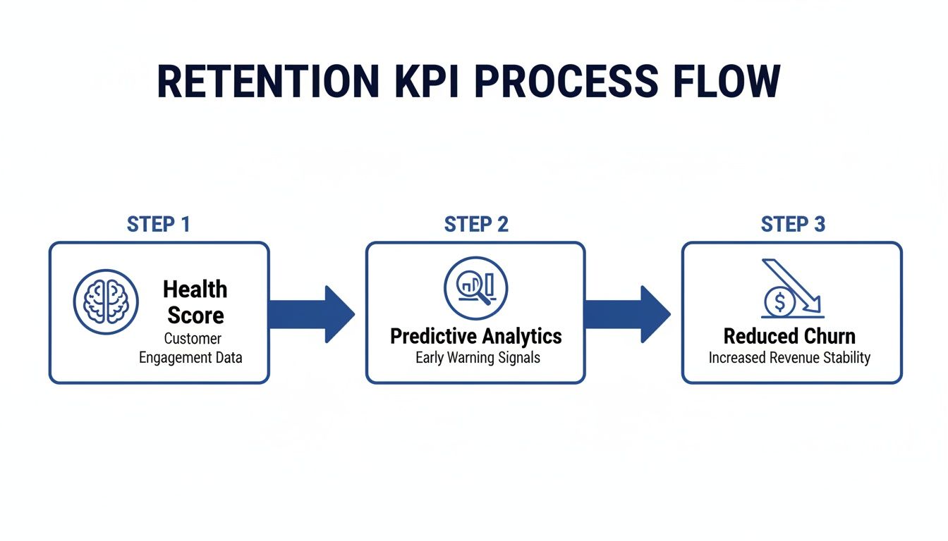
When you instrument your product and payment data to feed a predictive model, you’re effectively building an early-warning system that drives proactive retention efforts.
Instrumenting Product Analytics
While Stripe tells you what a customer is paying, your product analytics data tells you why they're likely to stick around. Tracking key user actions is the secret to building meaningful leading indicators, especially a solid customer health score. You don't need to track every single click. Instead, focus on the actions that genuinely correlate with long-term value.
The key is to identify your "value events"—the specific user behaviors that signal a customer is getting real, sticky value from your product.
A few real-world examples:
- Project management tool: Creating a new project, inviting 3+ team members, and completing 5 tasks in the first week.
- Social media scheduler: Connecting more than 2 social accounts and scheduling 10+ posts.
- Analytics platform: Building and saving a custom dashboard.
Once you know what they are, you can track these events with product analytics tools or a simple JavaScript snippet. The frequency and recency of these actions become the raw ingredients for your customer health score. A customer who was active three months ago but hasn't performed a value event in weeks is a massive churn risk, even if their payments are current.
Pro Tip: Don’t try to boil the ocean on day one. Start by tracking just 3-5 core value events. You can always add more later. The goal is to get a directionally accurate signal quickly, not to build a perfect system from the get-go.
Unifying Data for a Single Source of Truth
This is where the magic happens. The real power comes from merging these two data streams—subscription info from Stripe and usage data from your product. When you put them together, you get a complete picture of customer health that neither could provide on its own.
This unified view helps you spot dangerous patterns before they become catastrophes. You might see an enterprise customer on an annual plan who hasn't logged in for 60 days. Their Stripe subscription looks perfectly healthy, but their product usage is screaming churn risk. Without an integrated system, this account would fly completely under the radar until it's too late.
Modern platforms are built to connect these dots for you. Tools like LowChurn link directly to your Stripe account and use a lightweight snippet to track product usage, feeding both data sets into a predictive model. This gives you a clear path for exploring the power of https://www.lowchurn.com/blog/predictive-analytics-for-customer-retention without needing a dedicated data science team. For more operational details, looking into best practices for implementing quality assurance processes in call centers can also offer practical insights into tracking key service metrics.
By moving away from isolated data silos and toward an integrated tracking system, you transform your KPIs from historical reports into an actionable, forward-looking early-warning system. This is the foundation for shifting from a reactive "firefighting" mode to a proactive retention strategy—one that lets you identify and save at-risk customers before they even think about canceling.
Building Your Customer Success Dashboard
Once you have all that data flowing, you need to bring it to life. A spreadsheet full of numbers is just noise; a well-designed dashboard is your mission control for retention. It’s about turning raw metrics into a clear story so you can make smart, fast decisions.
The whole point is to move beyond static, backward-looking reports. Your dashboard shouldn't just tell you what happened last month. It needs to show you what’s likely to happen next week and point your team exactly where to focus their energy for the biggest impact.
From Data Points to a Cohesive Story
A great customer success dashboard isn’t just a jumble of charts. It tells a story. You start with the big picture and then drill down into the nitty-gritty. Think of it as going from a 30,000-foot view of your business health right down to the individual accounts that are crying out for attention.
You'll want to build your dashboard around a few core components:
- High-Level MRR Health: Right at the top, you need a snapshot of your revenue engine. This means your current MRR, your Net Revenue Retention (NRR) trend, and your MRR Churn Rate. These are your north-star metrics—they tell you if the overall strategy is actually working.
- Customer Health Distribution: How many of your customers are 'Healthy,' 'At-Risk,' or 'Poor'? A simple bar chart can give you an instant feel for the health of your entire customer base. If that distribution suddenly shifts, you’ve got a powerful early warning signal.
- Dynamic At-Risk Account List: This is the most critical, actionable piece of the puzzle. It should be a live, prioritized list of customers whose health scores have taken a nosedive. The key here is to sort this list by revenue impact so your team always tackles the highest-value accounts first.
A dashboard is only as good as the actions it inspires. If your team looks at it and doesn't know what to do next, it's just a collection of vanity charts. Prioritizing at-risk accounts by MRR turns data into a clear to-do list for your CSMs.
Setting Up Actionable Alerts and Triggers
A dashboard you have to constantly check is a productivity killer. The real magic happens when you set up automated alerts that push critical information to your team exactly when it matters. This flips your dashboard from being a passive report into an active, automated early-warning system.
You need to set up triggers based on specific KPI changes. Route these alerts directly into your team's existing workflow, whether that’s a Slack channel, an email, or a task in your project management tool.
Here are a few real-world examples of alerts you should set up:
- Usage Dip Alert: Trigger a Slack notification to the assigned CSM when a high-value account's weekly product usage drops by more than 50%.
- Health Score Threshold: Automatically create a task in your CRM for a CSM to reach out the moment a customer's health score slips from 'Healthy' to 'At-Risk.'
- Key Feature Disengagement: If a customer who religiously used a "sticky" feature suddenly stops, send an automated, targeted email with tips or a case study about that very feature. It’s a gentle, helpful nudge.
Here’s a rough sketch of what a clean, actionable dashboard can look like. It pulls together the financial health, predictive signals, and a clear action list all in one place.
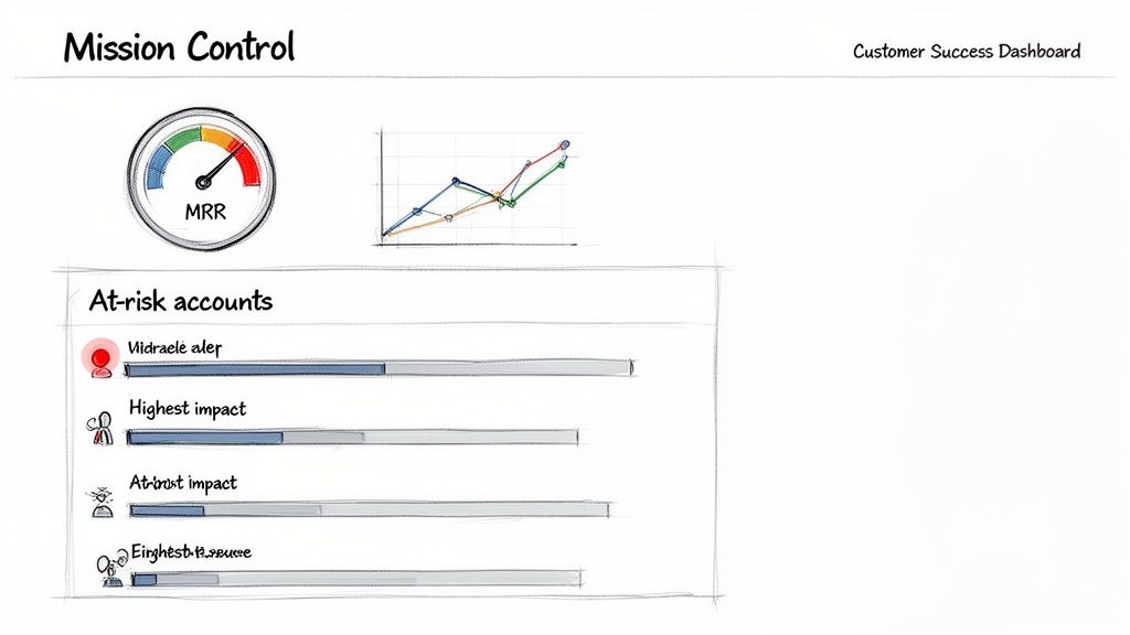
This kind of view instantly tells you the two most important things: how much money is on the line and which specific customers need a lifeline, all sorted by their financial impact.
Watching for Critical Signals
With your dashboard and alerts running, your team can finally spot patterns that would otherwise be invisible. For instance, you might see a sudden drop in health scores across an entire customer segment right after you ship a new feature. That's not just a handful of isolated issues; it's a strategic insight telling you the release might have backfired for a specific user persona.
By building this visual mission control, you empower your team to stop fighting fires and start preventing them. You're connecting your customer success KPIs directly to daily actions, ensuring that your data isn't just being tracked—it's being put to work to protect and grow your revenue.
Turning Red KPIs into Retention Wins
A dashboard blinking with red warning lights doesn’t do you much good without a fire extinguisher. Data is only useful when it forces you to act, and this is where all your hard work defining and tracking customer success KPIs finally pays off. It's time to build your 'retention playbooks'—your pre-planned, battle-tested responses for when specific KPIs start to sour.
These playbooks transform your team from reactive problem-solvers into a proactive retention force. When a customer’s health score suddenly plummets, there’s no panic. Instead, your team knows exactly what to do, who needs to do it, and when. It’s all about creating a system that connects a specific negative signal to a specific positive action, every single time.
Designing Your First Retention Playbooks
You don’t need to create a massive, 100-page manual on day one. Start small. Focus on the most common and high-impact churn signals you're already seeing in your data.
Your goal is to build a simple, repeatable process that anyone on the team can pick up and run with. A great playbook clearly outlines the trigger (what went wrong), the sequence of actions (what we do now), and the desired outcome (what a win looks like).
Let's walk through a couple of real-world examples.
Scenario 1: The Quiet Customer
You get an alert: a mid-tier account's product usage has nose-dived by 70% in the last two weeks. Their health score just flipped from ‘Healthy’ to ‘At-Risk.’
- Trigger: Health score drops below your threshold because of low product adoption.
- Playbook Action 1 (Automated): An automated, targeted email goes out immediately. This isn't a generic "we miss you!" message. It's a genuinely helpful note highlighting a high-value feature they haven’t touched yet, complete with a link to a 2-minute video tutorial.
- Playbook Action 2 (Human Touch): At the same time, a task is automatically created in your project management tool and assigned to their CSM. The task is direct: "Schedule a 15-minute check-in with [Customer Name] within 48 hours to discuss their goals."
- The Goal: Re-engage them with useful content and a personal touch. You want to uncover the root cause of the disengagement before they even start thinking about canceling.
Get Ahead of Financial Hiccups
Retention isn't just about product engagement—it’s also about good financial hygiene. Payment failures are a silent killer for SaaS companies. They often cause involuntary churn from customers who never actually intended to leave. A solid playbook here can save a surprising amount of revenue.
Scenario 2: The Expiring Credit Card
Your system flags that a key customer’s card on file is set to expire next month.
- Trigger: An automated alert for an upcoming card expiration date.
- Playbook Action 1 (Automated Dunning): A smart dunning campaign kicks in 30 days before the renewal date. It sends a friendly, low-pressure email asking the user to update their payment info. This feels more like a helpful reminder than a collections call.
- Playbook Action 2 (Personal Outreach): If the card isn't updated within two weeks, the CSM gets a task to make a quick personal call. The conversation is framed around ensuring their service continues without a hitch, not just demanding a new card number.
- The Goal: Prevent involuntary churn and avoid a service interruption that could frustrate a perfectly happy customer.
By creating these simple 'if-this-then-that' playbooks, you remove the guesswork and panic from retention. Your team isn't just staring at red KPIs; they're executing a proven strategy designed to turn a negative trend into a positive conversation.
Evolving Your Playbooks Over Time
Let's be clear: your first playbooks won't be perfect. And that's completely fine. The trick is to treat them as living documents that you constantly refine.
As you run these plays, you'll gather real-world feedback. Maybe you learn that a certain email subject line gets a much higher open rate, or that for enterprise accounts, a check-in call before an automated email is far more effective.
This continuous feedback loop is what makes your customer success engine smarter over time. You’ll start connecting the dots between your actions and their direct impact on your core customer success KPIs. You’ll see which playbooks consistently nudge a customer from 'At-Risk' back to 'Healthy' and which ones need to be tweaked or thrown out.
This is what it's all about—building a system where defining, tracking, and visualizing your KPIs leads to a series of smart, data-informed interventions. This is how you stop churn in its tracks and build a loyal customer base that sticks with you for the long haul.
Common Questions About Customer Success KPIs
When SaaS founders and customer success leaders start digging into their data, a few key questions always pop up. It's easy to get lost in the sea of metrics, but a little bit of focused thinking can make all the difference. Let's tackle some of the most common hurdles we see teams face.
Which Customer Success KPI Should I Focus on First?
It's tempting to want to track everything at once, but that's a classic recipe for analysis paralysis. If you're just starting, forget the dozens of potential metrics and zero in on just two. This approach gives you a powerful, balanced view of your business's health without all the noise.
Start with this pair:
- Monthly Recurring Revenue (MRR) Churn Rate: This is your north star, the ultimate source of truth. It’s a lagging indicator, meaning it tells you what already happened, but it gives you an unflinching look at whether you're delivering real value. It’s the bottom-line number that confirms if you're holding onto revenue.
- A Core Product Adoption Metric: This is your crystal ball—a crucial leading indicator. Your job is to pinpoint the one "aha moment" feature in your product. What's the single action that, when a customer takes it, makes them incredibly likely to stick around? Track the percentage of new users who complete that action within their first week.
This combination is so effective because it gives you both a rearview mirror (MRR Churn) and a windshield (Product Adoption). You see your current financial reality and get a predictive signal of what's coming. This keeps your team focused on actions that directly impact these two critical numbers.
How Often Should I Review My KPIs?
The right cadence really depends on the metric and who's looking at it. The leadership team doesn't need to be bogged down with daily operational stats, and your CSMs don't need to obsess over quarterly LTV figures.
Here’s a good way to think about it:
- Daily or Weekly (The Front Lines): Your customer success team needs to live and breathe leading indicators like customer health scores and dynamic at-risk account lists. Checking these constantly allows them to jump in proactively before a small problem turns into a cancellation notice.
- Monthly and Quarterly (The Big Picture): Leadership should focus on lagging indicators like Net Revenue Retention (NRR) and Customer Lifetime Value (LTV). This rhythm is perfect for spotting broader trends and making smart, strategic decisions about the product roadmap and overall CS strategy.
Automated dashboards are your best friend here. They let your team monitor the daily signals in real-time without the soul-crushing work of manually pulling reports every morning.
Can I Track KPIs Without an Expensive Tool?
Absolutely. You can definitely bootstrap this in the beginning. Manually exporting data from Stripe and your product analytics into a Google Sheet is a perfectly valid way to get started. You can calculate basic churn rates and get a feel for product usage this way.
But let's be honest about the limitations. This manual process is a massive time sink, it's incredibly prone to human error, and you get zero real-time insight. The biggest drawback? You can't create the dynamic, predictive customer health scores that are the foundation of any modern, proactive retention strategy.
The truth is, a good tool often pays for itself by saving just one or two at-risk customers from churning. The ROI isn't just about saving your team a few hours; it's about fundamentally shifting from reactive fire-fighting to a proactive, automated system that protects your revenue 24/7.
Ready to stop fighting fires and start preventing churn? LowChurn provides an AI-powered early-warning system for SaaS companies on Stripe. Get predictive health scores, prioritized at-risk account lists, and actionable retention playbooks—all with a setup that takes less than 60 seconds. See how it works.