
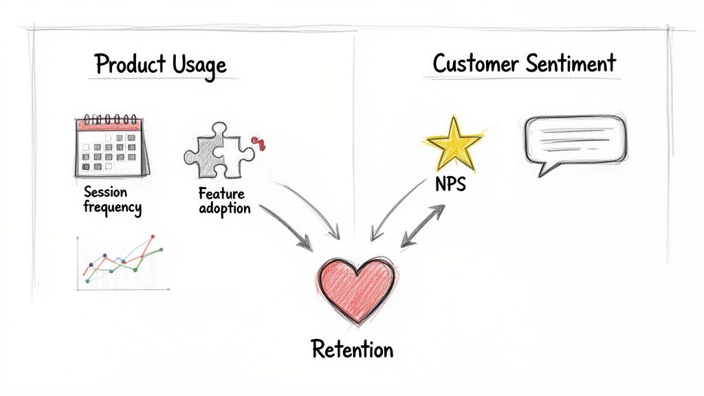
To really get a handle on customer engagement, you have to look at two things together: how people are actually using your product (think session frequency, which features they adopt) and how they feel about it (like their NPS score). This is how you move past vanity metrics and start seeing what actions truly predict who will stick around and grow with you.
What Customer Engagement Really Means for SaaS
Before you start instrumenting events and building dashboards, let's get on the same page about what "engagement" actually means for a subscription business. Real engagement isn't just about daily logins or time spent in the app. It’s the ultimate measure of the value a customer gets from your product and how loyal they are to your brand.
For a SaaS company, a truly engaged customer has woven your product into their daily or weekly workflow. They aren't just logging in; they're completing the key actions that solve their core problems, they’re quick to adopt new features, and they see your tool as essential to their success.
This deep interaction is one of the best leading indicators of customer health you can find. An engaged user is far less likely to churn, much more likely to upgrade, and often becomes your best salesperson through word-of-mouth.
Beyond Simple Activity Metrics
It’s so easy to fall for the trap of tracking superficial metrics. Daily Active Users (DAU) or average session duration can look impressive on a slide, but they often hide the real story. Someone could be logging in every day out of habit, getting very little value, and be silently on the verge of churning.
To do this right, you need a more sophisticated approach that pulls together a few different kinds of data.
To get a complete picture of engagement, we need to track metrics across three core categories. Each one tells a different part of the customer story, and together, they provide a holistic view that's far more reliable than any single metric.
Core Customer Engagement Metric Categories
| Metric Category | What It Measures | Example Metrics |
|---|---|---|
| Product Usage | Quantitative data on what users do in the app and how often. | Session Frequency, Feature Adoption Rate, Key Action Completion, Time-to-Value (TTV) |
| Customer Sentiment | Qualitative data on how customers feel about the product and brand. | Net Promoter Score (NPS), Customer Satisfaction (CSAT), Support Ticket Trends |
| Business Outcomes | The tangible financial and growth results of engagement. | Retention/Churn Rate, Customer Lifetime Value (CLV), Expansion MRR, Referrals |
Combining these different lenses is what separates high-growth SaaS companies from the rest. You're not just tracking clicks; you're connecting those clicks to customer happiness and, ultimately, to revenue.
One of the most battle-tested ways to measure sentiment is the Net Promoter Score (NPS). It's a simple, powerful way to gauge loyalty by asking how likely users are to recommend your product. Anyone who scores a 9-10 is a Promoter, 7-8 are Passives, and 0-6 are Detractors. Elite SaaS companies often hit NPS scores above 50, while the average for subscription services on platforms like Stripe is closer to 30-40. You can explore more engagement measurement benchmarks to see how you stack up.
Key Takeaway: An engaged customer isn't just an active user; they are a successful user. Your entire measurement strategy should be built around the specific actions that directly correlate with customer success and value, not just raw activity.
Establishing a Clear Framework
The end goal here is to build a complete, holistic view of the customer journey. You need to pinpoint the exact actions and signals that show a customer is getting real, long-term value.
For an email marketing platform, this might be "Campaign Sent" or "Audience Segment Created." For a project management tool, it’s probably "Task Completed" or "New Team Member Invited."
Once you've established this framework, you've laid the foundation for predicting retention and proactively spotting at-risk accounts before they go cold. The rest of this guide will walk you through turning this theory into practice—transforming raw user actions into a powerful engine for growing your Monthly Recurring Revenue (MRR).
Figuring Out Which User Actions Actually Matter
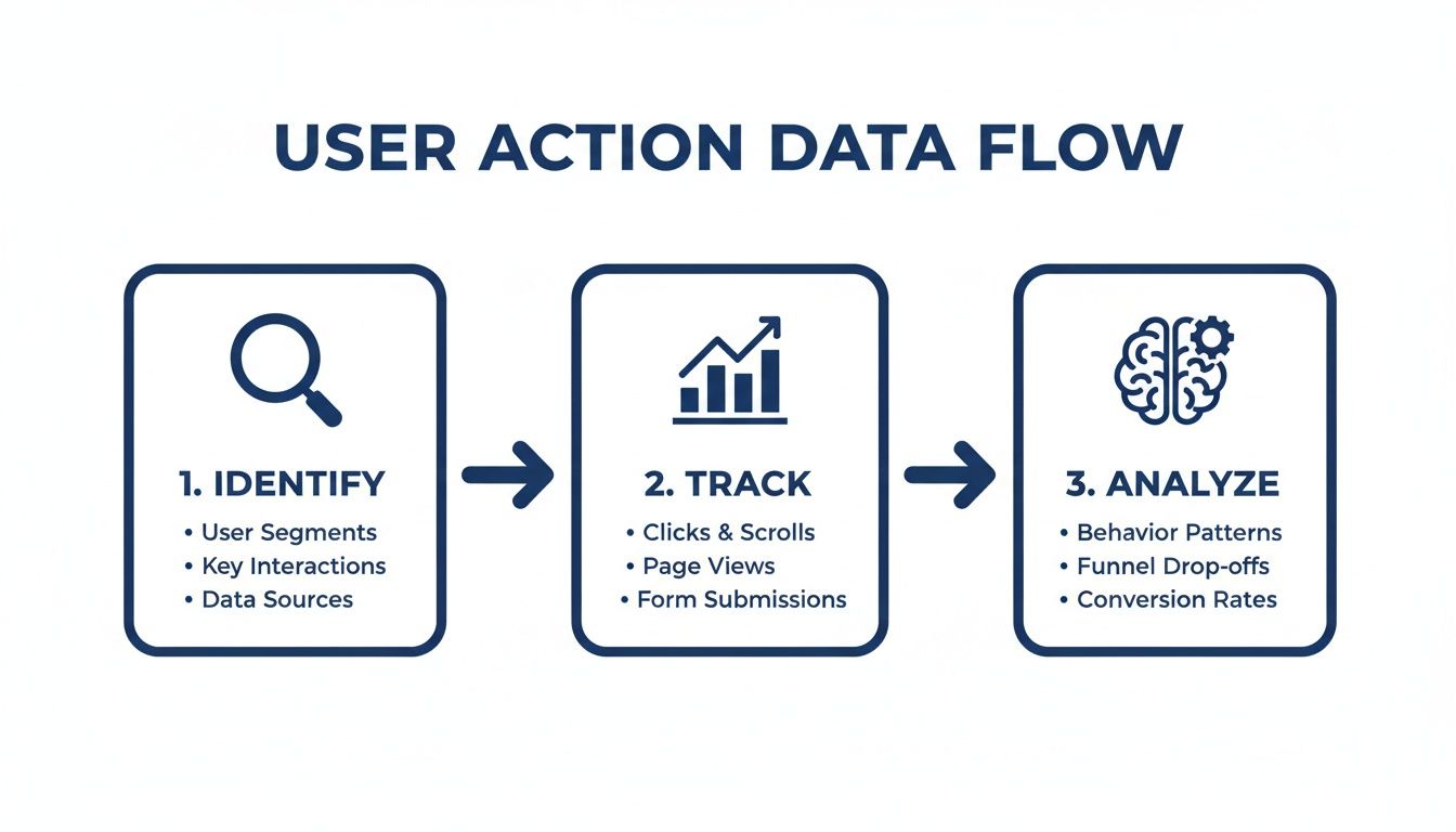
Alright, theory is great, but let's get down to brass tacks. To really get a handle on customer engagement, you have to stop thinking in abstracts and start collecting real data. This all begins with identifying and tracking the specific things people do inside your app—we call these events—that show they're getting real value.
A classic mistake I see all the time is trying to track everything. Every click, every hover, every page view. You’ll just end up drowning in a sea of noisy, useless data. The trick is to be surgical. Focus only on the actions that signal a user is making meaningful progress. These are the "aha!" moments, the actions that directly tie to why customers stick around.
Pinpoint Your Core Value Events
Every SaaS product has a handful of make-or-break actions that deliver on its core promise. I'm not talking about generic stuff like "User Logged In." We need to go deeper. What are the specific milestones that prove a user is solving the exact problem they hired your product for?
For a project management tool, this isn't just about logging in. It's about:
- Project Created: The user has actually started a new initiative.
- Task Assigned to Teammate: They're pulling others in and collaborating.
- Report Exported: They're taking value out of your app to use elsewhere.
Now, if you're running an analytics platform, the key events will be totally different:
- Dashboard Customized: They’re personalizing the tool to fit their needs.
- Data Source Connected: A critical setup step that truly unlocks the product's power.
- Alert Created: They trust your tool enough to rely on it for proactive monitoring.
Your first real task is to get your team in a room and nail down the 5-10 core value events for your product. These events are the foundation of your entire engagement scoring system.
Create a Simple Event Tracking Plan
Once you know which user actions are critical, you need a straightforward plan to track them. This plan acts as a blueprint for your engineers or for setting up a tool like Segment or Mixpanel. It's all about making sure the data you collect is clean and consistent right from the start.
For every single event you track, you need to capture a few key pieces of information. Getting this structure right is what will allow you to slice and dice the data in powerful ways later.
My Advice: Keep your initial plan simple. Seriously. Start with only the most important events and build from there. Clean data on a few key actions is infinitely more valuable than a messy dataset covering hundreds of trivial ones.
A solid, basic tracking plan needs to define three things for every event:
- Event Name: A clear, consistent name for the action, like
report_exported. Pick a naming convention (snake_case or camelCase) and stick to it. - User Identifier: A unique ID that connects the action back to a specific person and their company (e.g.,
user_id,account_id). - Event Properties: The contextual details that give the action meaning. For a
report_exportedevent, you’d want to know thereport_type("weekly_summary") or theexport_format("PDF").
Following this structure turns basic action tracking into a goldmine of behavioral data. You can start answering not just if a user is active, but how they're using your product.
Of course, what users do is just one side of the coin. To get the full picture, you also need to know what they think. That's why it's so important to pair this quantitative data with effective customer feedback collection strategies. When you combine what users do with what they say, you get a much truer sense of customer health.
Building a Weighted Customer Health Score
Raw event data is a good starting point, but let’s be honest, it's just a pile of actions. To really get a handle on customer health, you need to distill all that noise into a single, telling number: a customer health score. Think of this score as your team’s internal compass, instantly showing who's thriving and who's starting to drift away.
The secret to a truly useful score is understanding that not all actions are created equal. A daily login is nice, but it's a vanity metric compared to a user inviting three new teammates. One shows habit; the other shows deep, sticky commitment. This is exactly where weighting comes into play.
The whole process is about identifying what really matters, tracking it, and then analyzing the patterns to build a score that actually means something for your business.
Assigning Weights to User Actions
At its core, a weighted score is all about assigning point values to events based on how much they correlate with retention. High-value actions that lead to long-term customers get more points. Simple as that.
I like to think of it like a video game. You get a few points for completing a small side quest, but you get a massive boost for defeating the final boss. Your health score should work the same way.
Let’s imagine a project management tool. A simple weighting system might look like this:
- Login: 1 point (They showed up.)
- Task Created: 2 points (They're using a core feature.)
- Report Exported: 5 points (They're getting tangible value out.)
- New Team Member Invited: 10 points (This is gold. They're embedding your tool in their organization.)
With this kind of system, you can immediately see the difference between a casual user who logs in (1 point) and a power user who invites their whole team (easily 50+ points). The score tells the story.
Sample Weighted Engagement Score Model
To make this more concrete, here’s a table that breaks down how you might structure this. This is just a starting point, of course—you'll want to adapt it to what matters for your own product. The "Rationale" column is non-negotiable; it forces you to justify every point.
| User Action/Event | Assigned Weight (Points) | Rationale |
|---|---|---|
| New Project Created | 8 | This is a primary signal of starting a new workflow and shows real commitment. |
| Feature X Adopted | 15 | Our data shows this is our stickiest feature; users who adopt it are 50% less likely to churn. |
| Integration Connected | 12 | Connecting another tool embeds us deeper into the customer's daily workflow, making us harder to replace. |
| Support Ticket Submitted | -5 | This flags potential friction. It isn't always a bad thing, but it's something to watch. |
| Daily Active Use (DAU) | 3 | Consistent use is good, but it's less impactful than specific, value-driving actions. |
This process of defining and weighting events is absolutely foundational. If you want to dive deeper, our complete guide on creating a customer health score has even more models and tips.
Incorporating Sentiment Data for a Holistic View
Usage data tells you what users are doing. Sentiment data tells you how they feel about it. Marrying the two is how you create a truly predictive health score. You might have a highly active customer who is secretly frustrated and on the brink of churning—a risk that usage data alone would completely miss.
Weaving sentiment into your score is pretty straightforward:
- NPS Promoter (Score 9-10): Add 20 points. These are your biggest fans.
- NPS Passive (Score 7-8): Add 5 points. They're content, but not true advocates.
- NPS Detractor (Score 0-6): Subtract 15 points. This is a major red flag that needs attention.
Expert Tip: Don't just stop at NPS. You can also give points for a great CSAT score after a support chat or subtract points when a user submits a bug report. The goal is a 360-degree view of the customer relationship.
When you blend behavior and sentiment, your score transforms from a simple activity tracker into a sophisticated tool for predicting what comes next. It becomes the pulse of your customer base, empowering your team to be proactive, not just reactive.
Using Cohort Analysis to Track Engagement Trends
A weighted health score is great for giving you a real-time snapshot of an individual customer's health. But to really understand how your product is evolving, you need to zoom out and look at groups of users over time. This is where cohort analysis becomes one of the most powerful tools in your arsenal for tracking customer engagement trends.
Are those product improvements you shipped last quarter actually making your app stickier? Is your new onboarding flow retaining users better than the old one? Cohort analysis is how you answer these critical questions by comparing the behavior of different user groups.
Grouping Users into Meaningful Cohorts
A cohort is just a fancy term for a group of users who share a common characteristic. In SaaS, the most common and effective way to do this is by sign-up date. For example, everyone who joined in January becomes the "January cohort," everyone from February is the "February cohort," and so on.
This simple grouping lets you track and compare the engagement levels of each new batch of users, week after week, month after month. It effectively isolates the impact of your product and marketing changes. If your January cohort retained 40% of its users after three months, but your April cohort (right after you launched that big new feature) retained 55%, you've got solid evidence that your changes are making a positive difference.
Key Insight: Cohort analysis transforms your engagement data from a noisy, aggregate number into a clear story. It shows you whether you're getting better or worse at creating an engaging product experience over time.
You’re no longer just guessing if a new feature moved the needle; you're seeing its direct impact on how users stick around. For a deeper dive into understanding customer behavior over time, exploring What Is a Cohort Analysis for Your Shopify Store? can provide valuable insights.
Interpreting Retention Curves
The visual output of a cohort analysis is usually a retention curve or a heat-map-style table. This chart shows what percentage of a cohort remains active over a set period. Learning to read these curves is where the real magic happens.
- Steep Drop-offs: If you see a huge percentage of users from a cohort disappear in the first few days or weeks, that’s a massive red flag. It almost always points to a problem with your onboarding. Users aren't finding that crucial "aha!" moment quickly enough, and they're bailing.
- Flattening Curves: This is the holy grail. A retention curve that eventually flattens out means you’ve achieved strong product-market fit. You've found a core group of users who get consistent, long-term value from your product and have baked it into their regular workflow.
- Improving "Smiles": When you layer multiple cohort curves on top of each other (e.g., January vs. April), you want to see each new curve flattening out at a higher level than the one before it. This visual "smile" is the proof that your product is becoming stickier over time.
This type of analysis is absolutely central to understanding the real impact of your product improvements. You can learn more about the fundamentals in our guide on what cohort analysis is and how it works.
Connecting Cohorts to Sentiment
Beyond just tracking activity, you can get even more sophisticated by layering sentiment data onto your cohorts. Tracking something like a Customer Satisfaction Score (CSAT) gives you immediate feedback on how well your product is meeting expectations. While industry benchmarks for SaaS hover around 80-85%, the top-tier companies consistently hit 90% or more—a figure that often correlates with 25% lower churn.
Imagine you survey 50 users in your latest cohort and 40 of them rate their experience as 'satisfied.' That's a CSAT of 80%. If that number dips below 75% for the next cohort, it's a clear signal of an engagement risk.
By measuring the average CSAT or NPS for each cohort, you can quickly see if newer users are happier than older ones were at the same stage. This powerful combination of behavioral data (what they do) and sentiment data (how they feel) gives you a complete, undeniable picture of your product's health and its trajectory.
Tying Engagement Data to Your Bottom Line: Revenue and Churn
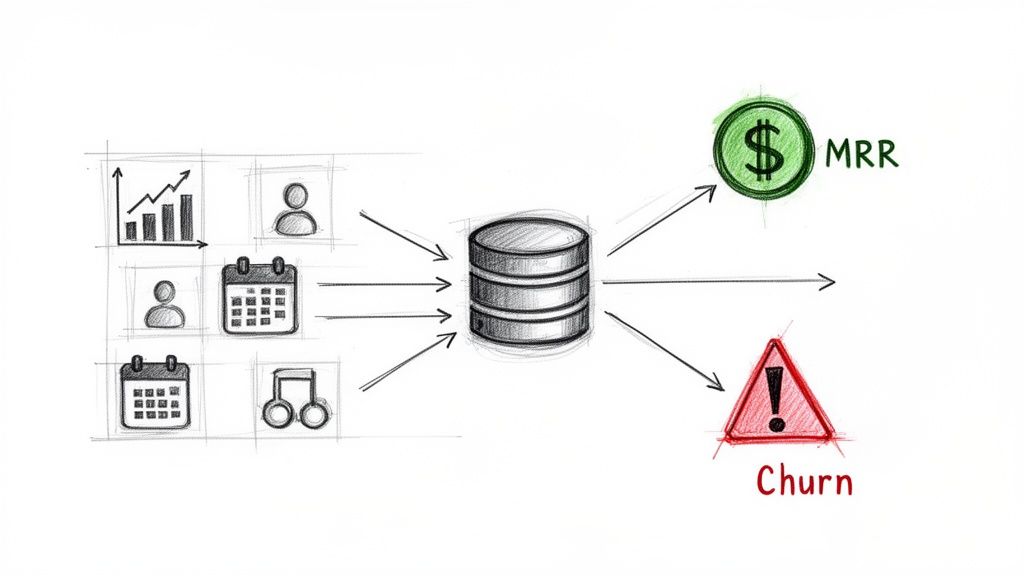
Tracking engagement metrics is interesting, but connecting them directly to your bank account is where the real work begins. This is the moment measurement turns into proactive strategy and, ultimately, profit. When you link your customer health score to actual financial outcomes, you stop just observing user behavior and start actively protecting your revenue.
The real unlock here is creating a unified view that pulls together your product usage data and the subscription signals coming from your payment processor, like Stripe. This is the connection that lets you see churn coming before it ever hits.
Bridging the Gap Between Product Usage and Subscription Signals
Think of your customer health score as a sophisticated early-warning system. A sudden drop in a user's score—maybe they stopped using a key feature or haven't adopted any new ones—is a powerful leading indicator. But on its own, it’s just a behavioral signal. The magic happens when you pair it with financial data.
Plugging into a system like Stripe enriches your product data with what's actually happening with their subscription. All of a sudden, that dip in their engagement score isn't an isolated event. You can see it right alongside other critical signals.
Here are the subscription events you need to sync up:
- Failed Payments: A customer's card fails once? It happens. A low-engagement customer's card fails? That's a massive churn risk.
- Plan Downgrades: Someone moving from a Pro to a Basic plan is a clear financial signal. When that move is preceded by a month of declining product usage, it tells a clear story of disengagement turning into reduced spend.
- Upcoming Renewals: Knowing a low-engagement customer has an annual renewal coming up next month gives your team a clear deadline for intervention.
- Trial-to-Paid Conversion: You can start tracking engagement from day one of a trial. This helps you spot the users who are most likely to convert, so you can focus your attention where it counts.
This combination of data creates a much sharper, more accurate picture. It helps you distinguish between a temporary dip in activity and a customer who is actively on their way out the door. For a deeper dive on connecting customer value to long-term revenue, check out our guide that explains what Customer Lifetime Value (CLTV) is and why it's so vital.
Expert Insight: The most dangerous churn signal is rarely a single event. It's the combination. A low health score plus a failed payment is a five-alarm fire. Your system needs to be built to spot and flag these multi-signal threats immediately.
Building a Proactive Churn Prevention Dashboard
With all this integrated data, you can build a simple but incredibly powerful dashboard that becomes the command center for your customer success team. The goal isn't to drown them in metrics; it's to give them a prioritized list of at-risk accounts that need immediate attention.
At a glance, your churn dashboard should answer three critical questions:
- Who is at risk? This is your list of accounts with a "Poor" or "Declining" health score.
- How much revenue is at risk? Next to each account, display its Monthly Recurring Revenue (MRR).
- Why are they at risk? Briefly show the top reasons for the low score, like "Low Key Feature Adoption" or "Recent NPS Detractor."
This setup allows your team to prioritize their outreach with surgical precision. Instead of treating every customer the same, they can focus their energy on saving the accounts that have the biggest impact on your bottom line. An account with $5,000 in MRR and a declining health score should get a call today. An account with $50 in MRR might get a targeted, automated email.
Moving From Reactive Support to Proactive Intervention
This data-driven approach fundamentally changes how your team operates. You shift from a reactive model—where you only hear from customers when something is wrong—to a proactive one where you reach out before they even realize there’s a problem.
Let's walk through a real-world scenario. Your dashboard flags a high-value account whose engagement has dropped 40% in the last two weeks. You also see their renewal is just 45 days away.
Instead of waiting for a cancellation email to land in your inbox, your customer success manager can now:
- Investigate: Dig into their specific usage patterns. Did they suddenly stop using a critical feature? Did you see their main power user go inactive?
- Reach Out: Send a genuinely helpful, personalized email. Something like, "Hey, I noticed you haven't exported any reports this month. We just released a new template that could save your team a ton of time. Can I show you how it works?"
- Offer Value: Provide targeted training, share a few best practices relevant to their goals, or offer a strategic review to help them get more out of the product.
This single workflow—detect a drop, prioritize by MRR, and intervene with a helpful, human touchpoint—is one of the most effective ways to slash churn and build real customer loyalty. It transforms your engagement metrics from passive data points into an active defense for your revenue.
Your Questions on Measuring Engagement, Answered
Even with a solid plan, getting into the weeds of customer engagement always brings up practical questions. I get it. Founders and their teams run into the same challenges time and again. This section tackles the most common questions we hear, giving you clear, straightforward advice to help you move forward.
What Are the First Three Engagement Metrics a New SaaS Should Track?
When you're just starting out, you've got to fight the urge to track everything. Simplicity and impact are your best friends. Don't try to boil the ocean.
Instead, zero in on these three foundational metrics. Together, they give you a surprisingly balanced view of how your first users are actually behaving and what they think of your product.
- Key Feature Adoption Rate: First, you need to be brutally honest with yourself: what is the one feature that delivers on your core promise? Once you've identified it, track the percentage of new users who actually use it within their first week. This is your "aha!" moment metric—it tells you if people are getting the value you promised.
- Session Frequency: This one is simple but incredibly powerful. Are people coming back every day? Once a week? It's a direct signal of habit formation and shows how deeply your product is embedding itself into their regular workflow.
- Net Promoter Score (NPS): Don't wait until you have thousands of users. Start asking, "How likely are you to recommend us?" right away. Even a handful of responses provides priceless qualitative feedback and establishes a baseline for loyalty long before you have big data to play with.
These three give you a solid read on product value, user habits, and customer sentiment without needing some overly-engineered setup.
How Often Should We Recalculate Our Customer Health Score?
This really depends on how your product is used, but for the vast majority of SaaS businesses, a daily recalculation is the gold standard.
Think of it as a real-time pulse on your customer base. A daily score lets your team react instantly to big changes. If a high-value account's score suddenly tanks overnight, your customer success team can jump on it that day, not a week later when the customer has already mentally churned.
Our Take: If you have technical limitations that make a daily calculation impossible, aim for a weekly update at the very least. A monthly score is just too slow. You'll miss all the critical warning signs until it's far too late to do anything about them.
Can I Measure Engagement Without Writing Any Code?
Absolutely. The old days of needing a dev team to spend a sprint instrumenting your product are long gone. Modern tools are built specifically to make this accessible to everyone.
Many platforms, our own included, work with a lightweight JavaScript snippet. You can typically install it in a few minutes using something like Google Tag Manager. Once that little piece of code is live, it starts capturing user activity automatically.
From there, you just connect your Stripe account. The system handles the rest, correlating product usage with subscription data to build out engagement scores and predict churn. This kind of low-code approach means founders and non-technical folks can get a seriously powerful engagement system up and running in less than an hour.
Should I Track Engagement for Free Trial Users?
Yes. A thousand times, yes. Tracking trial engagement isn't just a good idea—it's critical. Your trial period is arguably the most important stage in the entire customer lifecycle.
The engagement data you collect here is the single best leading indicator of who will convert. By seeing which trial users are hitting your key features and forming habits, you can spot your future paying customers with incredible accuracy.
This data is a game-changer for two reasons:
- It lets you focus your sales or support energy on the users who are showing clear buying intent through their actions.
- It shines a bright light on the friction points in your onboarding that cause other users to stall out and disappear, giving you a clear roadmap for product improvements.
A high trial engagement score is one of the most reliable predictors of future MRR you can possibly have.
Ready to stop guessing and start predicting churn? LowChurn uses AI to analyze product usage and Stripe data, giving you a 7–30 day warning before a customer cancels. Install in 60 seconds and see which customers are at risk today.