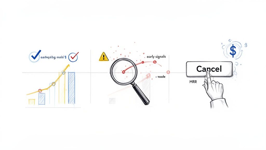
Predicting which customers are about to churn really boils down to one thing: shifting from reactive to proactive. Instead of waiting for that dreaded cancellation email to land in your inbox, you need to spot the leading indicators of disengagement—those subtle changes in product usage and subscription behavior that tell you a customer is drifting away. This often happens weeks before they make the final call.
Why Reactive Churn Management No Longer Works
Let’s be honest: by the time a customer clicks "cancel," it’s almost always too late. That decision was probably made weeks, if not months, ago. Relying on exit surveys and dunning emails is like trying to patch a leak after the house has already flooded. For any modern SaaS business, this reactive approach is a losing game.
The problem goes way beyond the immediate hit to your monthly recurring revenue (MRR). The hidden costs pile up fast, silently killing your growth. In the high-stakes SaaS world, acquiring a new customer can cost 5-7 times more than retaining an existing one. Spotting churn risks early isn't just nice to have; it's a game-changer.
Research consistently shows that 70-80% of customers who churn give off clear warning signs at least 30 days before they actually cancel. A significant drop in product usage is almost always the primary red flag.
The True Cost of a Lost Customer
Waiting for a cancellation confirmation means you're only looking at lagging indicators—data that confirms what already happened. The real opportunity is in the leading indicators, those faint signals at-risk customers broadcast long before they're gone for good.
These signals are usually buried in your product analytics and Stripe data, just waiting to be uncovered. They aren't dramatic events, but subtle shifts in behavior:
- Declining Engagement: A user who once logged in daily now only shows up once a week.
- Reduced Feature Adoption: They stop using the "sticky" features that correlate with long-term value.
- Payment Hesitation: A switch from an annual to a monthly plan, or a recent payment failure.
Each of these is a quiet cry for help. Ignoring them is like ignoring a check engine light—you can keep driving for a while, but a breakdown is inevitable.
Shifting your mindset from analyzing why customers left to predicting who is about to leave is the single most powerful change a SaaS company can make to protect its revenue. It transforms retention from a defensive reaction into a proactive growth strategy.
Adopting a Proactive Stance
The difference between a reactive and proactive strategy is stark. Take a look at how the two approaches stack up.
Reactive vs Proactive Churn Management
| Attribute | Reactive Approach (Lagging Indicators) | Proactive Approach (Leading Indicators) |
|---|---|---|
| Timing | Post-cancellation | 7-30 days before churn |
| Data Sources | Exit surveys, support tickets, cancellation reasons | Product usage, billing events, feature adoption |
| Key Question | "Why did they leave?" | "Who is at risk of leaving?" |
| Actions | Win-back emails, offering discounts to return | Personalized outreach, targeted training, value reinforcement |
| Outcome | Low success rate, high MRR loss | High retention rate, protected MRR |
As you can see, a proactive strategy is all about using these faint signals to create clear, actionable insights.
It means you stop asking, "Why did they cancel?" and start asking, "Who is showing early signs of disengagement, and what can we do right now to help them succeed?" This is the bedrock of modern churn prediction. For a deeper dive into the foundational concepts of forecasting future trends, you can explore what is predictive analytics and its applications.
By building a system to detect these early warnings, you give your team the most valuable asset in retention: time. Time to intervene, re-engage, and prove your value before the thought of cancelling even enters their mind. This guide will show you exactly how to do that.
Finding the Real Clues That Signal Churn
Predicting churn isn't about some mystical sixth sense; it's about knowing exactly where to look for the clues. And the best clues—the most powerful signals—are already flowing through your systems, hiding in plain sight within your product usage data and your Stripe account.
Forget vanity metrics like total logins or time on site. To get a real sense of who's about to cancel, you have to dig deeper into the nuanced behaviors that show a customer's investment in your product is fading. This is about spotting the leading indicators, not the lagging ones. A cancellation survey tells you why someone left, but a quiet dip in their feature usage tells you they’re thinking about leaving.
This kind of predictive work has become essential for SaaS teams, especially now. With 30% of companies reporting that their churn rates have gone up in the last year, we can't afford to be reactive. For businesses under $10M in revenue, churn can easily hit 20% annually, making proactive retention one of the most important levers for growth.
Behavioral Signals: What Your Product Usage Is Telling You
Your product analytics platform is a goldmine. It's packed with behavioral signals that almost always show up before a customer churns. These are the subtle but powerful shifts in how people interact with your software. The goal is to get past surface-level activity and lock onto the specific actions tied directly to the value your product delivers.
Instead of just tracking logins, start looking at more meaningful metrics:
- Shrinking Session Duration: A user who used to spend 20 minutes deeply engaged in your app now just pops in for two minutes. This is a classic sign they're no longer finding real value and are just "checking in" out of habit.
- Ignoring "Sticky" Features: You know those 2-3 core features that your best, longest-term customers can't live without? When you see an account’s usage of these "sticky" features drop off, it's a major red flag.
- Fewer Core Actions: If you run a project management tool, a core action is something like "create a new task" or "complete a project." A steady decline in how often users perform these key, value-driving actions is a clear signal of disengagement.
A deep dive into behavioral churn analysis is crucial for uncovering the most powerful churn signals and proactively addressing customer attrition. By focusing on how people use your product, not just if they use it, you can identify at-risk customers with much greater precision. Explore this topic further with this great resource on Behavioral Churn Analysis.
Transactional Signals: The Story in Your Stripe Data
While product usage tells one side of the story, your Stripe data reveals the other, equally critical half. Transactional signals are often the final warnings you get before a customer churns for good, reflecting their financial commitment and overall sentiment. These events are direct, quantifiable, and incredibly predictive.
Think of your Stripe data as a financial narrative for each customer. Here are the key plot points to watch for:
- Recent Payment Failures: Sure, it can be an accident, but a failed payment is often a soft churn signal. The customer might be intentionally letting the payment fail because they’re on the fence about renewing and this forces a decision.
- Subscription Downgrades: When a customer moves from a premium plan to a basic one, they are actively reducing their investment. They're telling you, with their wallet, that they see less value in your service than they did before.
- The Switch from Annual to Monthly: This is a classic sign of wavering commitment. A customer moving off an annual plan is shedding their long-term lock-in, making it frictionless to cancel in the next 30 or 60 days.
By weaving these behavioral and transactional signals together, you can build a truly holistic view of account health. This data fusion is the bedrock of a reliable customer health score, which rolls all these disparate signals into a single, actionable metric. You might be interested in our guide on creating an effective customer health score to learn more about this process.
Ultimately, these signals are the raw ingredients for your prediction model. When you track them systematically, you turn the abstract challenge of "reducing churn" into a concrete, data-driven problem you can actually solve.
Building Your First Churn Prediction Model
Okay, you've pinpointed the most powerful signals that a customer is about to leave. Now it's time to connect the dots and build an early-warning system. The goal here is simple: create a reliable process that answers the critical question, "Which of our customers are most likely to cancel in the next 7–30 days?"
Building a churn prediction model isn't just for data science PhDs anymore. We'll walk through how to turn those individual data points into a cohesive, predictive engine. This means exploring everything from simple, rule-based systems you could build in a spreadsheet to more sophisticated machine learning models that find patterns you'd never spot on your own.
The basic flow is straightforward: you combine behavioral data from your product with financial data from Stripe to fuel the prediction model.
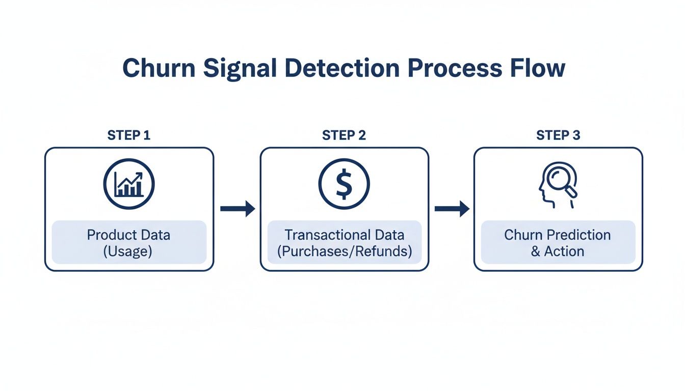
These two data sources—what users do and how they pay—are the essential inputs for any effective churn prediction effort.
Labeling Your Data Correctly
Before a model can learn anything, you need to give it a historical "answer key." This means looking back at your customer data and clearly labeling who churned and who didn't. This step, called data labeling, is the absolute foundation of your entire project.
For most SaaS businesses, "churn" is a customer who cancels and doesn't come back within a specific window, like 30 days. To create your answer key, you’ll take a snapshot of all active customers at a point in the past (say, three months ago) and see what happened to them.
- Churned (1): A customer was active on January 1st but canceled their subscription by February 1st.
- Not Churned (0): A customer was active on January 1st and was still active after February 1st.
This simple binary outcome—a 1 or a 0—is exactly what your model will learn to predict.
The Power of Feature Engineering
Raw data on its own is pretty useless. A last_login_date of 2023-10-15 doesn't tell a model much. But what if you reframe it as days_since_last_login: 18? Now that's a powerful signal.
This transformation process is called feature engineering. It’s where the real magic happens, turning basic data into meaningful predictors.
A few practical examples from the field:
- Recency: Instead of just a timestamp, calculate
days_since_last_core_action. - Frequency: Count things up, like
feature_X_uses_last_30d. - Ratios: Create metrics that show trends, like
support_ticket_ratio(this month's tickets divided by last month's).
These engineered features give your model the context it needs to tell the difference between a happy, engaged user and one who is quietly slipping away.
Choosing Your Modeling Approach
You don't need a massive AI to get results. The right approach really depends on your team's skills, the complexity of your data, and how easily you need to explain the results.
I've seen many SaaS founders surprised to learn that a simple, interpretable model that's 80% accurate is often far more valuable than a 90% accurate 'black box.' When your customer success team can see why a customer is flagged, they can tailor their outreach and be dramatically more effective.
Let's look at two common starting points.
Modeling Approaches: A Comparison
| Approach | Description | Pros | Cons |
|---|---|---|---|
| Rule-Based System | A simple set of "if-then" conditions. Example: "If days_since_last_login > 30 AND support_tickets_last_30d > 5, then flag as at-risk." |
Highly Interpretable: Easy for anyone to understand. Quick to Implement: Can be built in a BI tool. |
Brittle: Fails to capture complex interactions. Requires Manual Tuning: Rules get outdated fast. |
| Logistic Regression | A statistical method that calculates the probability of churn. It assigns a "weight" to each feature to measure its impact. | Interpretable: You can see which features matter most. Good Baseline: A solid performance benchmark. |
Assumes Linearity: Might miss complex patterns. Requires Clean Data: Sensitive to outliers. |
For most companies, starting with logistic regression is a fantastic move. It gives you clear insights into what’s driving churn and sets a solid baseline. From there, you can always move to more advanced techniques like gradient boosting.
Of course, you can also skip the manual build. Platforms like LowChurn handle this entire process automatically, connecting to Stripe and your product data to build, deploy, and maintain a high-accuracy model without needing a data scientist on staff.
Putting Your Churn Predictions to Work
A predictive model sitting on a server is just a clever piece of code. Its real value comes to life only when its insights are used to drive action. Once your model is built, the truly critical work begins: evaluating its performance, plugging it into your workflow, and empowering your team to save revenue based on its predictions. This is where you turn data science into tangible business results.
A simple "accuracy" score can be incredibly misleading. Let’s say only 2% of your customers churn each month. A model that predicts no one will churn is technically 98% accurate, but it’s completely useless for retention. That’s why we need to dig into more nuanced metrics that tell the whole story.
The reality of SaaS churn can be harsh. Average annual churn rates often hover between 10-14%. The gold standard is under 5%, yet a staggering 60-70% of companies miss this target, costing them billions in lost MRR. For teams using Stripe, this is a solvable problem. Platforms like LowChurn can fuse product usage patterns with subscription status to predict churn 7-30 days in advance with 85% accuracy, opening the door for instant retention campaigns. For more on this, check out the true cost of SaaS churn on revenera.com.
Setting a Smart Prediction Threshold
Your model will generate a churn probability for each customer, a number between 0 and 1. The next step is deciding on a threshold to separate "at-risk" from "healthy." For example, you might flag anyone with a score above 0.6.
Setting this threshold is a classic balancing act.
- Set it too high: You'll only flag customers who are practically one foot out the door. Your predictions will be super precise, but you’ll miss the chance to save many other at-risk accounts.
- Set it too low: You’ll flood your customer success team with false alarms, flagging healthy customers and diluting their focus.
The sweet spot is a threshold that balances precision (how many flagged customers actually churn) and recall (how many of the customers who actually churned were caught by your model). I always recommend starting with a threshold that creates a manageable list for your team, then tweaking it as you see how your campaigns perform.
From Predictions to Actionable Alerts
The most brilliant predictions are worthless if they're trapped in a database. You have to get these insights into the hands of your customer success team so they can act on them immediately. This isn’t about emailing them a giant spreadsheet once a week; it’s about weaving the predictions directly into their daily tools.
Here are a few ways to make that happen:
- Real-Time CRM Integration: Pipe churn scores and at-risk flags straight into your CRM, whether it’s Salesforce or HubSpot. This puts the risk level right next to a customer’s support tickets and contact history, giving your team the full picture.
- Prioritized At-Risk Lists: Create a dynamic dashboard that shows the top 10 or 20 customers most likely to churn. This gives your team a focused, high-impact to-do list every single day.
- Automated Slack or Email Alerts: Set up alerts that ping the account manager the moment a high-value customer’s churn score crosses your threshold. This triggers rapid, personalized intervention when it counts the most.
To truly understand if your model is working, you need to look beyond a single accuracy number. The table below breaks down the key metrics we use to evaluate a churn model's real-world performance.
Churn Prediction Model Evaluation Metrics
| Metric | What It Measures | Why It Matters for Churn Prediction |
|---|---|---|
| Precision | Of all customers your model flagged as "at-risk," what percentage actually churned? | High precision means your CSM team isn't wasting time on false alarms. It builds trust in the model. |
| Recall (Sensitivity) | Of all the customers who actually churned, what percentage did your model correctly identify? | High recall means you're catching most of the customers who are about to leave, maximizing your opportunities to save revenue. |
| F1-Score | The harmonic mean of Precision and Recall, providing a single score that balances both. | A great all-in-one metric to gauge the model's overall effectiveness, especially when the cost of a false positive vs. a false negative is similar. |
| AUC-ROC Curve | A graph showing the model's performance across all possible classification thresholds. | This helps you visualize the trade-off between catching more churners (recall) and avoiding false alarms (precision), allowing you to pick the best threshold. |
Each of these metrics gives you a different lens through which to view your model's performance. Together, they paint a complete picture, helping you fine-tune your thresholds and intervention strategies for maximum impact.
A Note on Privacy and Security
When you integrate tools to predict customer churn, data security has to be a top priority. Modern platforms like LowChurn are built with a privacy-first mindset.
By using a read-only Stripe key, these systems access only the essential subscription metadata needed for prediction—things like plan status and subscription start dates. Critically, they never touch sensitive financial details or personally identifiable information (PII). This approach gives you powerful insights while ensuring you remain fully compliant and maintain your customers' trust.
If you're thinking about your own retention strategies, you might find our guide on how to reduce customer churn helpful.
Turning Churn Predictions into Saved Revenue
So you've built a model that can predict who's about to leave. Great. But a prediction is useless until you do something with it. This is where the rubber meets the road—turning those data-driven flags into actual, saved monthly recurring revenue (MRR).
The goal here isn't to just blast out a generic "we miss you" email. It's about launching targeted, context-aware interventions the moment a customer's risk score spikes.
Real retention work is about figuring out why a customer is unhappy and offering a specific solution. The playbooks you build need to be clear, measurable, and simple enough for even a small team to manage.
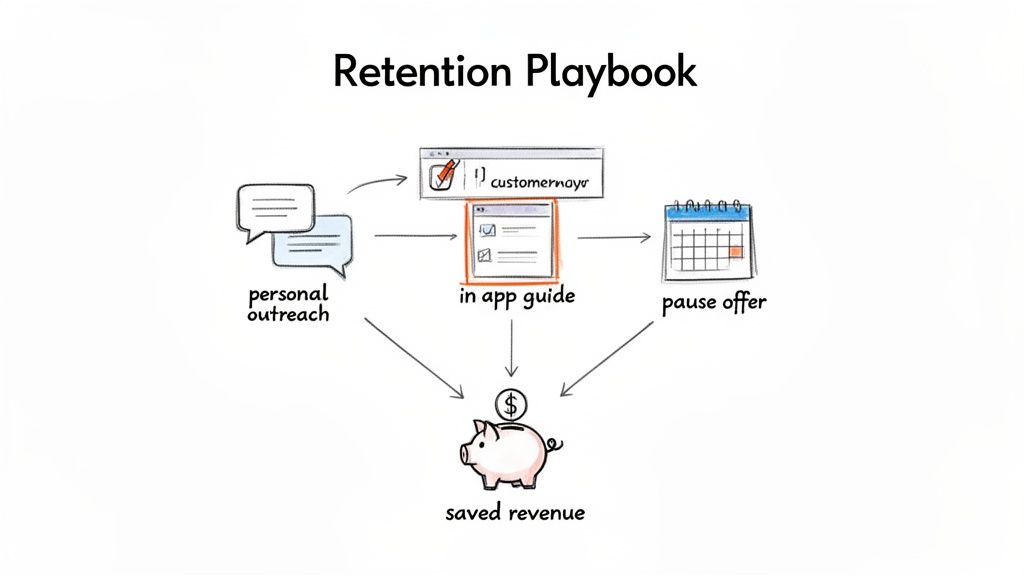
Designing Your Retention Playbooks
A "playbook" is just a pre-defined set of actions you take when a specific churn signal pops up. For every playbook, you need three things: the trigger, the action, and how you’ll know if it worked. This simple framework shifts churn prevention from a chaotic scramble to a systematic, revenue-saving process.
Here are a few battle-tested playbooks you can steal and adapt for your own SaaS.
The High-Value Disengagement Playbook: This one's for your biggest accounts when they suddenly go dark.
- Trigger: A customer in your top 10% by MRR crosses your high-risk threshold because their usage of key features has plummeted.
- Action: A founder or the head of success sends a personal, non-automated email. Don't try to sell anything. Just be helpful. Something as simple as, "Hey [Name], noticed you haven't used [core feature] lately. Is everything working as you expected?" can open a critical conversation.
- Measurement: Watch the reply rate and see if the customer logs back in and re-engages within 7 days.
The Feature Adoption Gap Playbook: This targets users who signed up but never really got the hang of your product's most valuable features.
- Trigger: An at-risk customer has barely touched the "sticky" features—the ones you know correlate with long-term happiness.
- Action: Set up a targeted in-app guide or a quick, educational email. For example: "Did you know you can save 3 hours a week by automating reports? Here’s a 60-second video showing you how."
- Measurement: Track the adoption rate of that specific feature for this group over the next 14 days.
The Involuntary Churn Prevention Playbook: This is how you proactively handle payment failures, which are often a canary in the coal mine.
- Trigger: A customer's payment fails.
- Action: Don't just send the cold, robotic "Your payment failed" email. Combine it with an offer that shows you're human. "We had trouble with your payment. If things are tight, would a one-month subscription pause help?" It’s an empathetic touch that can stop a cancellation in its tracks.
- Measurement: See how many users update their card versus how many take the pause. Then, compare the 90-day retention rate of both groups.
The best retention campaigns aren't built on one heroic save. They're built on a system of small, automated, and personal interventions that add up over time to protect your bottom line.
Measuring the Impact on Your Bottom Line
To prove this is all worth the effort, you have to connect your actions directly to revenue. The only metric that truly matters here is Saved MRR.
Setting up tracking is pretty straightforward:
- Tag At-Risk Customers: As soon as your model flags a customer, tag them in your CRM or analytics platform.
- Log the Playbook: Make a note of which intervention you used for that specific customer.
- Check the Outcome: At the end of the month, see how many of the tagged customers are still with you.
- Calculate Saved MRR: Add up the MRR from all the customers you successfully kept.
This creates a simple feedback loop. You'll quickly see which playbooks actually work and be able to show the direct ROI of your churn prediction efforts.
Of course, you can't save everyone. But for those who do slip through, win-back strategies can be surprisingly effective. If you want to go deeper, check out our guide on proven customer win-back strategies. It's the perfect next step once your initial retention playbooks are up and running.
Common Questions About Predicting Churn
As you start thinking about building a churn prediction system, a bunch of questions always pop up. Let's walk through some of the most common ones I hear from SaaS founders and customer success teams when they first dive into predicting who's about to cancel. The good news? This is more doable now than ever before.
You don't need a massive, years-long dataset to get this off the ground. You'd be surprised how quickly meaningful patterns can show up with just 3-6 months of solid product usage data and subscription history from a tool like Stripe.
How Much Historical Data Do I Need?
Here's the thing: it's less about the timeframe and more about the number of churn events you have on record. A model needs to see what churn actually looks like for your business to learn from it.
As a solid rule of thumb, aim for at least 50-100 churned customers in your historical data. That's usually enough to build a reliable first model that gives you a real signal.
Of course, more is always better. The beauty of modern tools like LowChurn is that they start with what you have and get progressively smarter as more customer history flows in.
Can I Predict Churn Without a Data Scientist?
Absolutely. This is probably the biggest change in the last few years. While a data scientist can build something incredibly custom, having one on staff is no longer a must-have to get ahead of churn.
No-code platforms have stepped in to do the heavy lifting for you. They’re built to handle all the tricky parts of the process:
- Data Integration: Connecting securely to your Stripe account and product analytics.
- Feature Engineering: Automatically turning raw data points into signals that actually predict behavior.
- Modeling: Training, testing, and deploying the machine learning algorithms.
- Deployment: Serving up the insights in a simple, actionable dashboard.
This frees up founders and CS teams to focus on what they do best—acting on the insights to save customers, not getting bogged down in building the system itself.
The conversation has shifted from "Can we even build a model?" to "How fast can we use these predictions to save customers?" The rise of no-code tools has been a complete game-changer for SaaS teams.
What Is a Good Model Accuracy Rate?
Most people aim for an accuracy rate between 80-90%, which is a strong benchmark for a churn prediction model. But be careful—accuracy by itself can be misleading. You really need to look at precision and recall, too.
Precision answers the question: "Of all the customers we flagged as at-risk, how many actually churned?" High precision means your team isn't chasing ghosts.
Recall answers: "Of all the customers who actually churned, what percentage did our model successfully catch?" High recall means you aren't missing many opportunities to intervene.
A great model finds the right balance. For context, platforms like LowChurn often hit 85%+ accuracy, giving your team a dependable signal to kick off retention efforts.
How Soon Can I Expect to See Results?
Way faster than you probably think. Once you connect your Stripe and product data—which can seriously take just a few minutes—the system starts crunching your historical data right away. Your first list of at-risk customers is often ready within 24-48 hours.
From there, you can start launching targeted retention playbooks immediately. Many companies see a measurable drop in churn and a real bump in saved MRR within the first few weeks. The secret is moving from prediction to action without any delay.
Ready to stop reacting to churn and start preventing it? LowChurn connects to your Stripe account in one click, using AI to predict which customers will cancel 7–30 days in advance. Launch your first retention campaign today.