So, what's a "good" churn rate?
Every SaaS founder and executive eventually asks this question. The honest answer? It depends. There isn't one magic number that fits everyone.
A good churn rate is a moving target, heavily influenced by who you sell to, how old your company is, and your price point. Think of it like a healthy heart rate—what’s normal for a marathon runner is very different from what's normal for someone taking a casual stroll. Both can be perfectly healthy, but their benchmarks are worlds apart.
What's a Good SaaS Churn Rate in 2024?
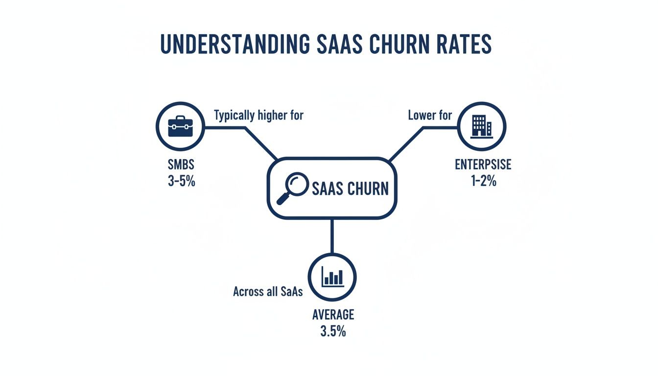
General wisdom suggests a good monthly churn rate for companies selling to small and mid-sized businesses (SMBs) lands somewhere between 3-5%.
If you're playing the long game and want sustainable growth, getting your annual churn rate below 5% is the gold standard. The real top-performers, especially those focused on large enterprise deals, often see rates as low as 1-2%.
Several key factors will determine where you should aim:
- Company Stage: An early-stage startup still trying to find its footing and nail product-market fit will naturally have a higher churn rate. It's just part of the process. A mature, established company with a full-blown customer success team should be aiming much lower.
- Target Market: Selling to SMBs often means higher churn. Their budgets are tighter, they're more sensitive to price, and it's easier for them to switch to a competitor. In contrast, companies selling to large enterprises can target much lower rates because their customers are locked into longer contracts and the product is deeply embedded in their operations.
- Price Point: Lower-priced products usually see more churn. The barrier to entry is low, but so is the barrier to exit. A higher average revenue per user (ARPU) often goes hand-in-hand with lower churn.
Finding Your True North
Understanding these nuances is the first step toward setting realistic goals for your own business. The average monthly churn rate for B2B SaaS companies has actually improved lately, dropping to around 3.5% from a high of 7.5% in late 2021. You can dig into more SaaS statistics and benchmarks on SellersCommerce.com.
To give you a quick reference point, here’s a breakdown of what acceptable churn looks like across different company sizes.
Quick SaaS Churn Rate Benchmarks by Company Size
| Customer Segment | Acceptable Monthly Churn Rate | Acceptable Annual Churn Rate |
|---|---|---|
| Early-Stage Startup | 5-7% | 51-65% |
| SMB-Focused | 3-5% | 31-51% |
| Mid-Market | 2-3% | 22-31% |
| Enterprise-Focused | 1-2% | 11-22% |
Use this table as a starting point to see how you stack up, but remember that your own context is what matters most.
A good churn rate isn't just a vanity metric; it's a vital sign for your business's health. It directly impacts your ability to forecast growth, guide product strategy, and secure investor confidence.
When you truly master your churn benchmarks, you can stop putting out fires and start proactively managing growth. It’s not just about knowing how many customers are leaving, but getting to the heart of why they’re leaving.
This is the foundation for building powerful retention strategies. Knowing your numbers is the key to improving your customer retention ratio, which is really just the other side of the churn coin. Let's dive in and learn how to interpret these benchmarks and use them to build a more resilient, sustainable SaaS business.
Translating the Language of Churn Metrics
To really get a handle on SaaS churn rate benchmarks, you need to speak the language. It’s not enough to know that churn is bad; you have to understand the nuances. The subtle differences between metrics are what separate the SaaS companies that are always putting out fires from those that see the smoke signals miles away.
This isn't about memorizing complex formulas. It’s about learning to read the story your numbers are telling. Think of your business as a bucket full of recurring revenue. Churn is the leak. To keep that bucket full, you have to know exactly where the leaks are and how fast they're dripping. Understanding key customer retention metrics, including churn rate is the first step.
Let's break down the most important ones.
Customer Churn: The Headcount of Lost Logos
The most straightforward metric is Customer Churn, sometimes called Logo Churn. It’s a simple headcount. This metric answers the question, "How many customers did we lose this month?"
It’s a foundational metric, a gut check on overall customer satisfaction and product-market fit. If a lot of customers are walking out the door, it could mean something’s wrong with your onboarding, your core features aren't hitting the mark, or your support is dropping the ball.
The calculation is as basic as it gets:
- (Customers Who Canceled in Period / Total Customers at Start of Period) x 100 = Customer Churn Rate
So, if you started the month with 500 customers and 25 of them canceled, your customer churn rate is 5%. Simple.
Revenue Churn: The Financial Impact
While Customer Churn tracks the number of logos, Revenue Churn tracks the dollars. This is arguably the more critical metric for your financial health because it measures the actual monetary damage from those lost customers.
After all, losing one enterprise client paying $10,000/month hurts a whole lot more than losing ten small startups paying $50/month, even though the customer churn is much lower in the first scenario.
As you can see, companies serving smaller businesses naturally face higher churn rates. This is precisely why just looking at customer churn isn't enough—you have to follow the money. And that leads us to two even more specific types of revenue churn.
Gross MRR Churn vs. Net MRR Churn
These two metrics, side-by-side, tell the complete story of your revenue momentum.
Gross MRR Churn: This is the raw, unfiltered number. It represents the total Monthly Recurring Revenue (MRR) you lost from both cancellations and downgrades in a given period. It’s a stark look at how much revenue walked out the door, no sugarcoating.
Net MRR Churn: This metric gives you the bigger picture. It starts with your Gross MRR Churn but then offsets that loss with any new revenue you gained from your existing customers through upgrades or add-ons (this is often called expansion MRR). It reveals the net change in your revenue from the customer base you already have.
The Leaky Bucket Analogy, Revisited: Gross Churn is just the water leaking out of the bucket. Net Churn, on the other hand, measures the leaks and the water you manage to pour back in from existing customers upgrading their plans.
Let's walk through a quick example to see how this works in the real world.
Imagine your SaaS business started the month with $100,000 in MRR.
- You lost $8,000 in MRR from customers canceling or downgrading. Your Gross MRR Churn is 8%.
- But, during that same month, you gained $10,000 in expansion MRR from existing customers who upgraded to higher tiers.
Here’s how you’d calculate your Net MRR Churn:
- ($8,000 Churned MRR - $10,000 Expansion MRR) / $100,000 Starting MRR = -2%
Your Net MRR Churn is -2%. This is what's known as negative churn, and it's the holy grail for SaaS businesses. It means your revenue from existing customers is growing faster than it’s shrinking. You’re actually growing before you even sign a single new customer. That’s a powerful engine for sustainable growth.
Understanding Why Not All Churn Is Created Equal
Looking at your overall churn rate is a bit like a doctor looking at a patient's temperature. It tells you something is wrong, but it doesn't tell you what or why. To truly diagnose the problem, you have to dig deeper and understand that not all customer departures are the same. The real, actionable insights are hidden in the reasons people leave.
The first step in any solid retention strategy is to segment your churn. The most fundamental split is between two very different categories: Voluntary Churn and Involuntary Churn. They stem from completely different causes, and more importantly, they demand completely different solutions.
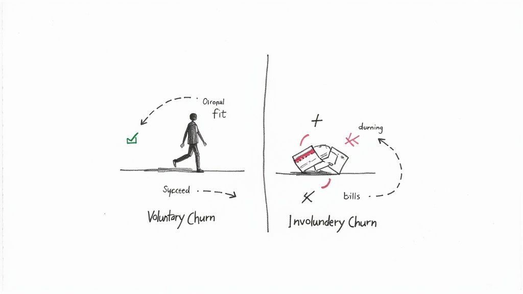
Voluntary Churn: The Conscious Decision to Leave
Voluntary churn is just what it sounds like—a customer makes a deliberate choice to cancel their subscription. They log in, go to their account settings, and hit that "cancel" button. This is an active decision, a direct result of their experience with your product, pricing, or customer service.
To get a handle on this type of churn, you have to play detective and retrace the customer's journey to find the breaking point. The reasons can be complex, but they usually boil down to a few common themes:
- Poor Onboarding: The customer never really "got" the product. They failed to activate key features, never experienced that "aha!" moment, and eventually just drifted away.
- Bad Product-Market Fit: Your solution just wasn't the right tool for their job, even if they thought it was during the trial.
- Perceived Lack of Value: The customer simply doesn't feel the benefits they're receiving are worth the price they're paying.
- A Better Offer from a Competitor: A rival swooped in with a more compelling feature set, a lower price, or a better support experience.
This kind of churn is a direct referendum on your core business. It hurts, but it's also your most valuable source of feedback.
Involuntary Churn: The Silent Revenue Killer
On the flip side, involuntary churn (sometimes called passive churn) is when a customer drops off without meaning to. They didn't decide to leave; a technical or administrative snag made the decision for them.
This silent killer almost always comes down to a failed payment. The usual suspects include:
- An expired credit card.
- A card that was lost or stolen.
- Insufficient funds in the account.
- A hard decline from the customer's bank for fraud prevention.
These might seem like small operational hiccups, but they add up fast. Involuntary churn can account for a staggering 20-40% of total churn in a SaaS business. That’s a huge chunk of revenue slipping away for completely preventable reasons.
The good news? Involuntary churn is the lowest-hanging fruit in your retention efforts. It’s a tactical problem, not a fundamental flaw in your product, which means it’s much easier to fix.
This distinction is crucial for building a smart retention plan. According to recent data, the average churn rate for B2B SaaS companies is 3.5%. Of that, voluntary churn typically accounts for 2.6%, while involuntary churn makes up the other 0.8%. You can explore more SaaS churn benchmarks and insights from a report by Vitally.io. While most churn is indeed intentional, that 0.8% represents recoverable revenue you're just leaving on the table.
By splitting churn into these two buckets, you can create a two-pronged strategy. One team can focus on the big-picture challenges of product, value, and customer success to tackle voluntary churn. At the same time, another can implement tactical systems like dunning management and payment retries to fight the silent killer of involuntary churn.
How Your Business Model Shapes Your Churn Rate
Trying to compare your churn rate to a single industry average is a fool's errand. It’s like putting a speedboat and a cruise ship in the same race—sure, they’re both on the water, but they're built for entirely different purposes and have vastly different performance standards.
Context is king. To find realistic SaaS churn rate benchmarks, you have to look inward first. Your company's age, revenue, and even how you sell your product all play a huge role in defining what a "good" churn rate actually looks like for you.
An early-stage startup scrambling to find product-market fit is going to have a much higher churn rate than a public company with a decade of customer data. That’s not a sign of failure; it’s a sign of its stage. The startup is still figuring things out, casting a wide net, and learning from users who aren't the right fit. Churn is just part of that messy, but necessary, process.
Meanwhile, a mature company has already dialed in its ideal customer profile and has battle-tested systems for onboarding and support. Their lower churn isn't magic; it's the result of years of stability and a deep understanding of their market.
The Influence of Revenue and Maturity
One of the best predictors of your churn rate is simply your company's size, usually measured in Annual Recurring Revenue (ARR). This isn't just a random correlation. It reflects the operational maturity that comes with getting bigger. As companies grow, they naturally invest in dedicated customer success teams, better retention tools, and smoother onboarding flows.
Those investments have a clear payoff. The difference in churn based on company size is stark. Companies with less than $10 million in ARR often have a median annual churn of around 20%. But once SaaS businesses cross that $10 million threshold, the average drops to about 8.5%. If you want to dive deeper into the numbers, 99firms.com has some great SaaS industry statistics worth exploring.
This really highlights a key turning point for any SaaS company. As you grow past that $10 million ARR mark, your ability to keep customers becomes a much more powerful and refined engine for growth.
Comparing a startup's churn to an enterprise leader's is an unfair fight. Focus on benchmarking against companies at a similar stage of maturity and revenue. Your goal is progress, not perfection against an irrelevant standard.
How Your Go-to-Market Strategy Impacts Churn
Your sales model also leaves a distinct fingerprint on your churn profile. Think about it: how you get customers is directly tied to how likely they are to stick around.
Low-Touch (Product-Led Growth): Companies that lean on a PLG model—think self-serve signups with little to no sales interaction—tend to see higher churn. The barrier to entry is low, which also means the barrier to exit is low. Customers haven't invested a lot of time, money, or political capital, so it's easy for them to walk away if they don't see value immediately.
High-Touch (Sales-Led): On the flip side, a high-touch, enterprise sales model almost always leads to lower churn. These deals are complex, involving multiple stakeholders, long contracts, and deep integrations. The cost of switching, both financially and operationally, is massive. That creates a powerful moat that keeps customers from leaving.
The data backs this up. Sales models that rely on channel partners often see the highest churn at around 17%, while traditional field sales teams boast the lowest at just under 12%. Knowing this helps set the right expectations. If your entire model is built for speed and volume, you better be prepared to build an equally powerful retention machine to balance out the naturally higher churn.
Actionable Playbooks to Reduce Customer Churn
Knowing your SaaS churn rate benchmarks is like getting a diagnosis from the doctor. It tells you where you stand. Now, it's time to write the prescription and move from analysis to action.
Lowering churn isn't about random acts of retention or panicked firefighting. It's about building a systematic, repeatable process. Creating dedicated playbooks turns churn reduction into a proactive habit that gets woven into your company's DNA.
Don't try to fix everything at once. The key is to focus on targeted interventions that solve the most common reasons customers walk away. Here are three battle-tested playbooks you can roll out to improve user success, catch at-risk accounts, and win back customers who are starting to drift.
The Onboarding Optimization Playbook
You never get a second chance to make a first impression. This is especially true in SaaS, where a clunky or confusing onboarding experience is one of the biggest reasons for early-stage churn. If new users don't get that "aha!" moment quickly, they won't stick around to see the value you offer down the road.
This playbook is all about getting new users to their first win as fast as possible. The goal is to guide them from signup to activation and, eventually, to forming a habit around your product. Your north-star metric here is the activation rate—the percentage of new users who complete a key, value-driving action in their first week.
Here’s how to build it:
- Map the Path to Value: Pinpoint the 3-5 essential actions a new user must take to get real value from your product. This isn't about teaching them every single feature; it's about leading them to that first successful outcome.
- Guide Them In-App: Use tooltips, interactive walkthroughs, and checklists to steer users through those critical actions. Tools like Appcues or UserGuiding are fantastic for this, letting you build these experiences without needing a developer.
- Automate Lifecycle Emails: Set up an email sequence that triggers based on what users do (or don't do). If someone gets stuck, send a helpful tip. When they complete a key step, send a high-five email that points them to the next logical action.
The Customer Feedback Loop Playbook
Customers rarely wake up one day and decide to leave out of the blue. It’s usually a slow fade. They gradually disengage over weeks or even months. This playbook is about creating systems to listen for the early warning signs of trouble so you can step in before it's too late.
The mission is to proactively spot at-risk accounts by systematically gathering and, most importantly, acting on user feedback. Your go-to metrics will be Net Promoter Score (NPS) and Customer Satisfaction (CSAT).
Capturing feedback isn't just about collecting data; it's about starting a conversation. When a customer gives you a low score, it's an opportunity to reach out, understand their frustration, and show them you're genuinely committed to their success.
Follow these steps to close the loop:
- Automate Surveys: Use tools like Delighted or Hotjar to send NPS or CSAT surveys at key moments—maybe 30 days after onboarding or right after a support ticket is closed.
- Create Triage Workflows: Set up automatic alerts for your customer success team whenever a low score comes in (a "detractor" in NPS-speak). This ensures a quick, personal response when it matters most.
- Analyze the "Why": Don't just obsess over the scores. Dig into the comments. Use a simple spreadsheet or a dedicated tool to categorize the feedback and spot recurring themes or product issues that need fixing. For more inspiration, check out these 10 actionable churn reduction strategies.
The Proactive Engagement Playbook
Even your happiest customers can drift away if they stop finding new value in your product. This playbook focuses on re-engaging users who are showing signs of slipping away. It’s about reminding them of your product's value and introducing them to features they might have missed.
Here, you’ll want to keep an eye on metrics like product adoption (how many features they use) and user login frequency. Predictive tooling can be a game-changer. For example, a platform like LowChurn analyzes usage patterns to flag customers who are likely to cancel, giving you a prioritized list of who to talk to first. For a deep dive, read our guide on how to reduce customer churn with specific tactics.
Put this playbook into action:
- Define Disengagement Signals: Figure out what "at-risk" behavior looks like for your product. It could be a sudden drop in weekly logins, not using a key feature for 30 days, or a dip in a custom health score.
- Launch Re-engagement Campaigns: Create targeted email or in-app campaigns that highlight a specific feature you know is relevant to that user's goals. A short video tutorial or an invite to a webinar on advanced use cases can work wonders.
- Offer a Human Touch: Have your customer success team personally reach out to high-value accounts that are going quiet. A simple message like, "Hey, noticed you haven't used [Feature X] in a while—can I help you get more value from it?" can make all the difference.
Using Cohort Analysis to Find the Real Story
A single, aggregate churn number is like a blurry photograph—it gives you a general idea of the scene but hides all the critical details. To really see what's going on, you need to sharpen the focus. For any SaaS business, the best way to do that is with cohort analysis.
This method lets you dig beneath the surface-level metrics to find the real story hidden in your data. It’s easily the most powerful diagnostic tool you have for pinpointing exactly what’s pushing customers away and what’s convincing them to stay.
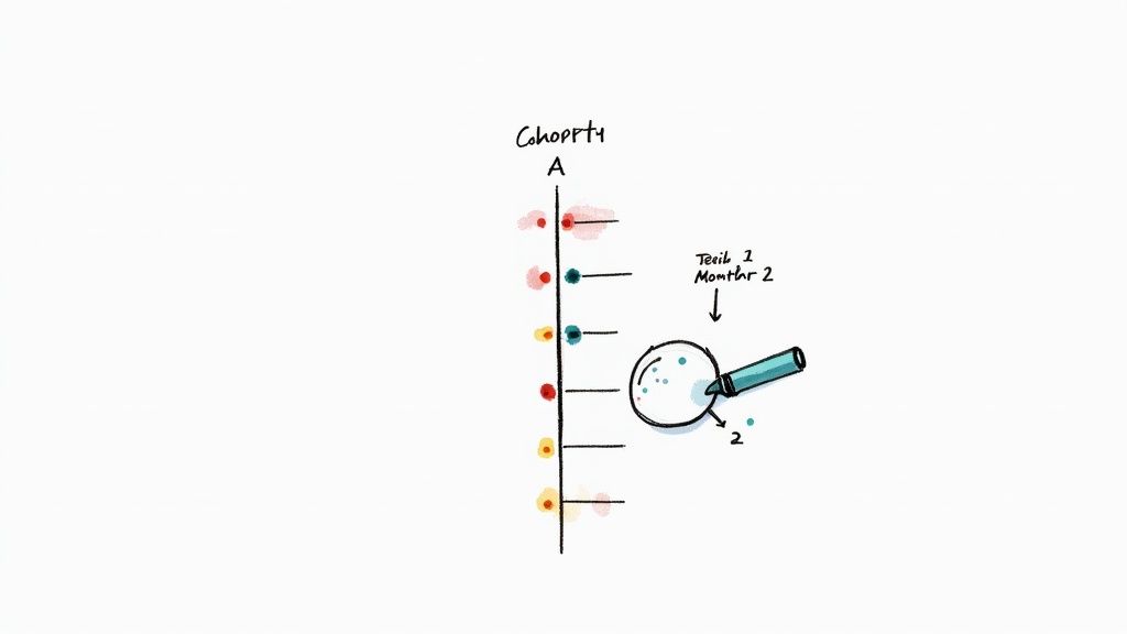
What Is a Customer Cohort?
Think of a cohort as a graduating class. It’s simply a group of users who all signed up for your product during the same time frame, usually the same month. For instance, all the customers who joined in January become the "January Cohort," those in February are the "February Cohort," and so on.
By grouping users this way, you can track their behavior as a unit over time. It lets you compare different "classes" against each other to see if your retention is getting better, worse, or just staying flat. You're turning a messy stream of user data into a clean, apples-to-apples comparison.
Cohort analysis isolates variables. It helps you determine if a spike in churn was a one-time event affecting a specific group or a systemic problem affecting everyone.
For example, did churn jump last quarter because of a fundamental issue with your product? Or was it just the cohort that signed up right after a buggy feature release? Answering that question is the first step toward finding a real solution instead of just guessing.
How to Read a Cohort Chart
A cohort chart, often called a retention table, is your go-to tool for this kind of analysis. It tracks the percentage of users from each cohort who are still active customers in the months following their signup.
Let's walk through a simple example to see how it can help you spot some pretty powerful trends.
Here’s a sample retention table. The goal is to see how well each group of new users sticks around over time.
Sample Monthly User Retention Cohort
| Signup Month | Users | Month 1 | Month 2 | Month 3 | Month 4 |
|---|---|---|---|---|---|
| January | 1,000 | 90% | 85% | 81% | 78% |
| February | 1,200 | 88% | 82% | 77% | 73% |
| March | 1,100 | 75% | 68% | 62% | 58% |
| April | 1,300 | 89% | 84% | 80% | 76% |
Looking at this, something clearly went wrong with the March cohort. Their retention in the very first month plummeted to 75%, a massive drop from the typical 88-90% seen in other months. That sharp decline is a huge red flag waving right in your face.
So, instead of panicking about your overall churn rate, you now have a specific place to start digging. What happened in March?
- Did you launch a new marketing campaign that brought in a bunch of poor-fit customers?
- Was there a buggy product update that soured the new user experience?
- Did you make a change to your onboarding flow that just confused people?
This level of detail finally allows you to connect specific business actions to their direct impact on customer retention. It’s a crucial link for understanding the long-term health of your business, especially when you learn how to calculate customer lifetime value and forecast growth.
By finding the real story in your churn data, you can stop reacting to problems and start proactively building a product that people genuinely want to keep using.
Common Questions About SaaS Churn
Even after you've got the basics down, the real world of SaaS churn benchmarks can throw you a few curveballs. Let's tackle some of the most common questions that pop up for SaaS founders and leaders.
What Is a Good Annual SaaS Churn Rate?
While monthly numbers are great for keeping a finger on the pulse, the annual churn rate tells you the real story about your business's long-term stability. A "good" annual churn rate typically falls somewhere between 5% and 7%.
But—and this is a big but—context is everything. If you're selling hefty enterprise contracts, you should be aiming for a rate well under 5%. On the other hand, if your customers are mostly small businesses, a churn rate of 10-15% might be perfectly healthy for your stage. The key isn't just the number itself, but seeing it trend downward as you grow.
Is It Possible to Have Negative Churn?
Absolutely. In fact, it's the holy grail for any SaaS business. Negative churn is what happens when the revenue you gain from your existing customers—think upgrades, add-ons, and new seats—outweighs the revenue you lose from cancellations.
Imagine you lost $5,000 in monthly recurring revenue (MRR) from customers who left. But in that same month, your loyal customers upgraded their plans and bought new features, adding $7,000 in expansion MRR. That's negative churn. It means your company is growing organically, even without signing a single new logo.
Should I Focus More on Customer Churn or Revenue Churn?
You need both, but for most SaaS companies, revenue churn is the metric that truly reflects the financial health of your business. Why? Because customer churn treats every customer the same. Losing a tiny startup on your cheapest plan is not the same as losing a massive enterprise client that accounts for a huge chunk of your revenue.
Key Takeaway: Look at customer churn to understand how many customers are leaving. But base your financial models and retention strategies on revenue churn to focus on where the real money is.
How Often Should I Calculate My Churn Rate?
The standard cadence is monthly. It's the sweet spot—frequent enough to catch worrying trends early and see if your retention efforts are working, but not so often that you're just reacting to random noise.
It's also smart to look at churn on a quarterly and annual basis. This lets you zoom out, smooth out any monthly bumps, and see how you're tracking against your bigger strategic goals and those all-important industry benchmarks.
Ready to get ahead of churn instead of just tracking it? LowChurn uses AI to analyze product usage and subscription data, flagging customers who are likely to cancel 7–30 days before they do. It’s time to stop reacting and start proactively saving your customers. Learn more at https://www.lowchurn.com.