
To get a handle on churn, you first need to know what you’re measuring. Simply put, the churn rate is the percentage of your customers who leave your service during a specific timeframe. You calculate it by dividing the number of customers who canceled by the total number of customers you had at the start of that period. Multiply that by 100, and you’ve got your percentage.
Why Churn Rate Is Your Most Critical SaaS Metric
Before we get into the nitty-gritty of the formulas, let’s be clear about something: churn isn’t just another metric. It's the silent killer of growth. Think of your business as a bucket. No matter how much water (new business) you pour in, you’ll never fill it up if there are holes in the bottom letting existing customers leak out.
That seemingly small monthly churn rate has a compounding effect that can absolutely wreck your annual recurring revenue (ARR) and seriously shorten your company's runway.
If you’re a SaaS startup processing payments through a platform like Stripe, a high churn rate is a massive red flag for investors. They see it as a symptom of deeper problems—poor product-market fit, unhappy customers, or a failure to deliver on your value proposition.
Monthly Churn vs. Annual Churn Impact
It's easy to look at a 2% or 3% monthly churn and think it's manageable. But when you zoom out, the annual impact is staggering. This table shows just how quickly a "small" monthly leak turns into a flood over the course of a year.
| Monthly Churn Rate | Equivalent Annual Churn Rate | What This Means for a 1000-Customer SaaS |
|---|---|---|
| 1% | 11.4% | You lose 114 customers every year. |
| 2% | 21.5% | You lose 215 customers—over a fifth of your base. |
| 3% | 30.6% | You lose 306 customers. |
| 5% | 46.0% | You lose 460 customers—nearly half your business. |
As you can see, even a few percentage points make a huge difference. That's why getting an accurate read on your churn is non-negotiable for building a sustainable business.
Understanding the Different Types of Churn
To really understand what's happening, you need to break churn down into its different forms. Each one tells a different part of the story and points toward a different solution.
- Customer Churn: This is the most basic calculation—the raw percentage of customers who cancel their subscriptions. It’s your headcount churn.
- Revenue Churn: This tracks the percentage of monthly recurring revenue (MRR) you lose from those cancellations. This is often more telling, because losing one enterprise client paying $5,000/month hurts a lot more than losing ten small accounts paying $20/month.
- Voluntary vs. Involuntary Churn: Voluntary churn is when a customer makes a conscious decision to leave. Involuntary churn is when they leave for passive reasons, like an expired credit card or a failed payment. This is the low-hanging fruit you can often fix.
The numbers in B2B SaaS don't lie. The average monthly churn rate hovers around 3.5%, which breaks down into 2.6% voluntary and 0.8% involuntary. For companies doing under $10 million a year, that annual churn rate often balloons to 20%. Imagine having to replace a fifth of your entire customer base every single year just to stand still. If you want to dig deeper, these customer success statistics paint a comprehensive picture.
For any founder, churn isn't just a metric to report—it's a diagnostic tool. A rising churn rate is an early warning signal that something is fundamentally wrong, whether with your product, pricing, or customer onboarding.
Ignoring that signal is a mistake most startups simply can't afford to make. Learning to calculate churn rate accurately is the first, most critical step toward building a subscription business that can actually grow and last.
The Fundamental Formula to Calculate Customer Churn
Let's cut right to the chase. The basic formula for calculating your customer churn rate is deceptively simple, but it’s the absolute foundation for understanding the health of any subscription business. It gives you a quick, high-level picture of how stable your customer base is over a given period.
Most companies start by tracking this on a monthly basis because it provides a regular, actionable cadence.
Churn Rate Formula: (Customers Lost in Period / Customers at Start of Period) x 100 = Customer Churn Rate %
This little equation spits out a percentage that tells you what portion of your customers walked away. It’s direct, easy to grasp, and gives you an immediate signal about your business.
A Practical Example with Stripe-Like Data
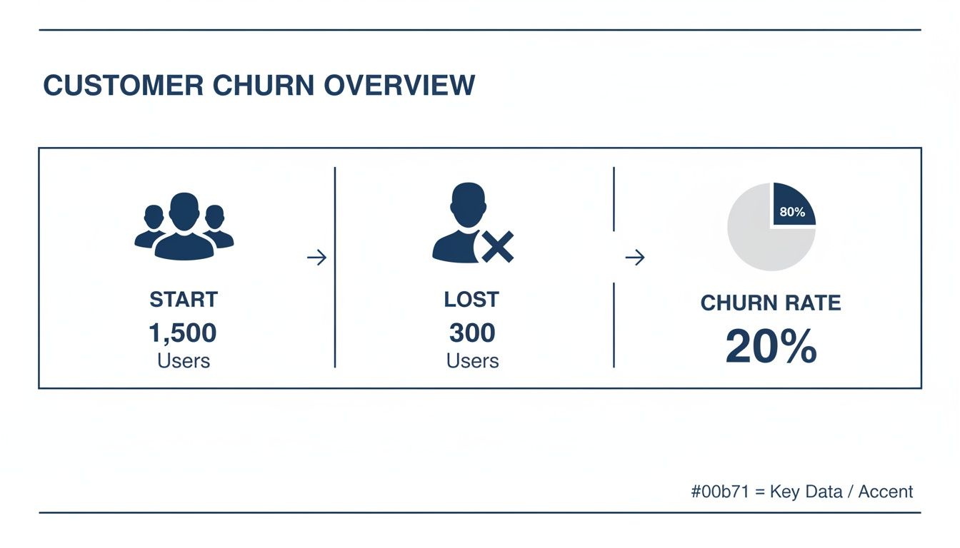
Theory is great, but let's see how this works in the real world. Say you run a SaaS company called "SaaSCo" and you're digging into your performance for the month of April. You pull up your Stripe dashboard or export a customer report.
Here’s what your data for April looks like:
- Customers on April 1: 500
- New Customers Acquired in April: 50
- Customers Who Canceled in April: 25
To figure out your churn rate, you only need two of those numbers: the customers you had on day one and the number that canceled. For this specific calculation, you'll ignore the new customers you signed up during the month.
Let’s plug those numbers into the formula:
(25 Lost Customers / 500 Starting Customers) x 100
That gives you 5%. So, for April, SaaSCo’s monthly customer churn rate was 5%. That single number tells a clear story: for every 100 customers you started the month with, five decided to leave.
Start of Period vs. Mid-Period Average
One of the first questions I always get from founders is which customer count to use in the denominator. Should it be the number of customers you had on the first of the month, or some kind of average?
While you'll sometimes see people advocate for using a mid-period average—especially in businesses with explosive growth—I almost always recommend sticking with the customer count at the start of the period.
Here’s why it's the more reliable approach:
- Clarity and Consistency: It gives you an unambiguous baseline. The number of customers you begin with is a fixed, known quantity, which makes your month-over-month comparisons much cleaner.
- Actionable Insight: This method purely measures your ability to retain the exact group of customers you were responsible for when the month began. It neatly separates retention from the noise of acquisition.
- Simplicity: Let's be honest, for busy founders and small teams, it’s the most straightforward way to get a trustworthy number without overcomplicating things.
Using your starting customer count keeps the calculation focused squarely on retention. It forces you to answer the most important question: "Of the customers we had, how many did we actually keep?" Answering that honestly is the first, crucial step toward making that number better.
Moving Beyond Headcount to Calculate Revenue Churn
Knowing your customer churn rate is a solid start, but it only gives you part of the picture. Think about it: losing ten customers on your $20/month starter plan hurts a lot less than losing one enterprise client paying $5,000/month. That's why smart subscription businesses obsess over revenue churn.
Revenue churn, often called MRR (Monthly Recurring Revenue) churn, shifts the question from "How many customers left?" to "How much money did we lose?" This single distinction provides a far more accurate gauge of your company's financial health and long-term stability.
This basic flow of losing customers is simple enough, but things get more interesting—and more valuable—when we start attaching dollar signs to those departures.
Gross vs. Net Revenue Churn
When you dig into revenue churn, you'll find two critical metrics: Gross and Net MRR Churn. Each one tells a unique and important story about your revenue.
Gross MRR Churn is the straightforward measure of all the recurring revenue you lost in a period. This includes outright cancellations plus revenue lost from customers downgrading to cheaper plans, which is often called contraction MRR. It's a raw, unfiltered look at your revenue leaks.
Gross MRR Churn Formula: (Churned MRR + Contraction MRR) / MRR at Start of Period x 100
This number tells you, without any sugar-coating, how much revenue is walking out the door. It’s a direct signal of customer satisfaction and product-market fit.
On the flip side, Net MRR Churn offers a more complete view of what's happening inside your existing customer base. It takes all the revenue you lost (from churn and downgrades) and subtracts the new revenue you gained from existing customers who upgraded their plans or added new services. We call this expansion MRR.
Net MRR Churn Formula: (Churned MRR + Contraction MRR - Expansion MRR) / MRR at Start of Period x 100
You absolutely need both. Gross churn pinpoints the problem areas, while net churn reveals the overall revenue momentum of your customer base. Getting a handle on these numbers is also a prerequisite to accurately calculating your customer lifetime value and building a truly sustainable business.
The Power of Negative Net Revenue Churn
Let's walk through a quick example. Imagine a SaaS company's performance in June:
- MRR at Start of June: $100,000
- Churned MRR (Cancellations): $8,000
- Contraction MRR (Downgrades): $2,000
- Expansion MRR (Upgrades): $15,000
First, we calculate the Gross MRR Churn. This is just the total revenue lost.
($8,000 + $2,000) / $100,000 = 10% Gross MRR Churn
Now, let's look at the Net MRR Churn by factoring in the revenue gained from expansion.
($8,000 + $2,000 - $15,000) / $100,000 = -5% Net MRR Churn
This is what we call negative churn—the holy grail for any subscription company. It means you generated more revenue from your existing customers than you lost from those who left or downgraded. In other words, your business actually grew that month without acquiring a single new customer.
This is the key to compounding growth. After all, a seemingly small 5% monthly churn can snowball into a devastating 46% annual churn rate. Once you have a firm grasp on your churn metrics, you can begin applying data-driven revenue optimisation techniques to start improving them.
Using Cohort Analysis for Deeper Churn Insights
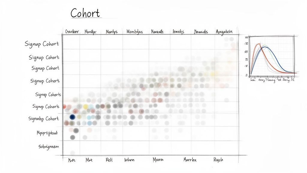
A single churn percentage is a decent starting point, but let’s be honest—it often hides more than it reveals. It tells you that you're losing customers, but it won't tell you who is leaving or why. To get those answers, you have to dig deeper with cohort analysis.
This is a powerful technique where you group customers based on a shared characteristic. The most common approach is to group them by the month they signed up. So, everyone who joined in January becomes the "January Cohort," everyone from February is the "February Cohort," and so on.
By tracking how long each group sticks around, you start to see trends that a single, blended churn rate would completely miss.
Uncovering the Hidden Stories in Your Data
Imagine your overall churn rate has been flat for the last six months. On the surface, you might think everything is stable. But a cohort analysis could tell a very different story.
Maybe your January cohort is incredibly loyal, with a really low churn rate. At the same time, maybe the cohort you acquired in April—the one from that big marketing push—is leaving at an alarming rate. The high retention from your older, loyal customers is completely masking the problem with your newer ones.
This is exactly where cohort analysis shines. It lets you:
- Evaluate marketing campaigns: Are customers from one channel sticking around longer than others?
- Assess product updates: Did that new feature you shipped in March actually improve retention for the customers who signed up after its release?
- Pinpoint onboarding issues: You might notice that customers who signed up in a specific month churned unusually fast, pointing to a potential problem with your onboarding flow at that time.
Essentially, you stop just knowing your churn rate and start understanding the behaviors that drive it. If you want to dive even deeper into the methodology, our guide on what is cohort analysis is a great resource.
Building a Basic Cohort Retention Table
You don't need fancy software to get started. You can build a perfectly functional cohort analysis right in a spreadsheet using an export from a tool like Stripe. The goal is to build a simple table that tracks the percentage of each cohort that is still active month after month.
Let's walk through what that looks like. Below is a simple table where each row is a signup cohort, and the columns track their retention over time. Month 0 is always 100%, since everyone was active at the moment they signed up.
Sample Monthly Customer Retention Cohort Analysis
| Signup Cohort | Month 0 | Month 1 | Month 2 | Month 3 | Month 4 |
|---|---|---|---|---|---|
| Jan 2024 | 100% | 92% | 85% | 81% | 78% |
| Feb 2024 | 100% | 94% | 89% | 86% | 83% |
| Mar 2024 | 100% | 88% | 79% | 72% | 65% |
| Apr 2024 | 100% | 95% | 91% | 89% | - |
Just a quick glance at this table tells us something is wrong. The March 2024 cohort is churning way faster than the others. That’s an immediate, actionable insight a blended churn rate would have totally buried.
This kind of table gives you a clear visual map of customer loyalty. You can spot improvements (look how strong the April cohort is starting out!) and pinpoint specific problem periods. This empowers you to diagnose the root causes of churn instead of just reacting to a single, misleading number.
Common Mistakes to Avoid When You Calculate Churn
Knowing the formulas is just the first step. Where most SaaS teams trip up is in the day-to-day application of those formulas. Small, seemingly minor errors can easily skew your churn rate, painting a picture of your business health that’s misleading at best. It all comes down to precision and consistency.
One of the most common stumbles I see is a fuzzy definition of an "active customer." Does your count include users on a free trial? What about accounts with paused subscriptions? If you don't have a firm, documented rule for this, your denominator will fluctuate month to month, making your churn metric totally unreliable.
Another classic pitfall is glossing over involuntary churn. These aren't customers who decided to leave; they're the ones who were lost because of a failed payment or an expired credit card. Lumping them in with voluntary cancellations completely masks a significant—and often easily fixable—source of revenue leakage.
Failing to Segment Your Churn Data
Treating all churn as one big number is a massive strategic error. A single, blended churn rate might tell you that you have a problem, but it won't tell you where or why. To get insights you can actually act on, you have to segment your data.
Breaking down churn by different customer groups is how you find the real story.
Consider these essential ways to slice your data:
- By Plan or Tier: Are customers on your basic plan churning faster than your enterprise accounts? This could point to issues with your pricing, feature sets, or the perceived value at lower tiers.
- By Acquisition Channel: Do customers who came from paid ads churn at a higher rate than those from organic search? Answering this helps you fine-tune your marketing spend toward channels that deliver long-term value, not just quick signups.
- By Tenure: Is there a mass exodus of new customers within the first 30 days? That’s a huge red flag for your onboarding process or a serious mismatch between your marketing promises and the actual product experience.
By not segmenting, you're flying blind. You might know your bucket is leaking, but you have no idea where the biggest holes are. Analyzing churn by cohort or plan is how you find them.
Misunderstanding Industry Benchmarks
Finally, don't set yourself up for failure (or false confidence) by comparing your churn rate to the wrong benchmarks. A "good" churn rate varies wildly depending on your industry, business model, and customer type. The churn you'd expect for a B2C mobile app is worlds away from an enterprise B2B platform locked into annual contracts.
For example, the financial services sector often sees a median churn around 19%, while B2B services can hit 17%. On the other end, some industries like media and professional services achieve an impressive 84% retention rate (which is just 16% churn), giving SaaS teams a high bar to aim for.
Understanding these nuances is crucial for setting realistic goals. To see how you stack up, you can explore more industry-specific churn data and get a much clearer perspective on your performance.
Putting Your Churn Data into Action
All the formulas and cohort tables in the world won't save a single customer on their own. The real value comes when you bridge the gap between analysis and action. To truly get ahead, you have to shift from just measuring churn to proactively preventing it.
This means finding the leading indicators—the early warning signs—that a customer is disengaging long before they hit the cancel button.
These red flags are often hiding in plain sight within your product analytics and customer feedback channels. Think about it: a drop in daily logins, fewer key features being used, or even a sudden decrease in support tickets can all be subtle cries for help. Your goal is to spot these patterns early and intervene.
Once you’ve identified what’s causing churn, the practical next step is often improving your product based on those user insights. Using product feedback platforms like Canny can be a great way to centralize this feedback, making sure your development efforts directly address real user needs and pain points.
From Reactive to Predictive Churn Prevention
Let's be realistic. Manually tracking these signals across hundreds or thousands of customers is nearly impossible for a growing SaaS team. This is precisely the problem we built LowChurn to solve.
Instead of you hunting for clues in spreadsheets, our AI-powered platform connects directly to your Stripe data to do the heavy lifting for you.
Our system analyzes product usage patterns and subscription signals to predict which customers are at risk of leaving 7–30 days in advance. We give you a powerful early-warning system so you can act when it matters most.
This predictive approach completely changes the game. You're no longer just reacting to a cancellation email; you're engaging a customer before they've even made the decision to leave.
With features like real-time health scores and one-click retention campaigns, we empower you to stop just measuring churn and start actively preventing it. Mastering the tactics to engage these at-risk users is a crucial next step, and you can explore our detailed guide on how to reduce customer churn for more actionable strategies.
This shift from hindsight to foresight is the final, most important step in turning your churn data into a powerful growth lever.
Stop churn before it happens. LowChurn uses AI to predict at-risk customers from your Stripe data and gives you the tools to keep them. Get your free demo today.