
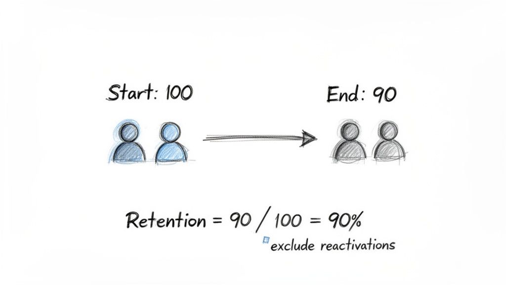
To calculate the retention ratio, you're essentially looking at how many customers you had at the start of a period versus how many of those same customers are still with you at the end. The key is to ignore any new customers you picked up along the way.
For any SaaS business, this isn't just another number on a dashboard. It’s a direct measure of your product’s value and how happy your customers are.
Why Retention Is Your Most Important Growth Metric
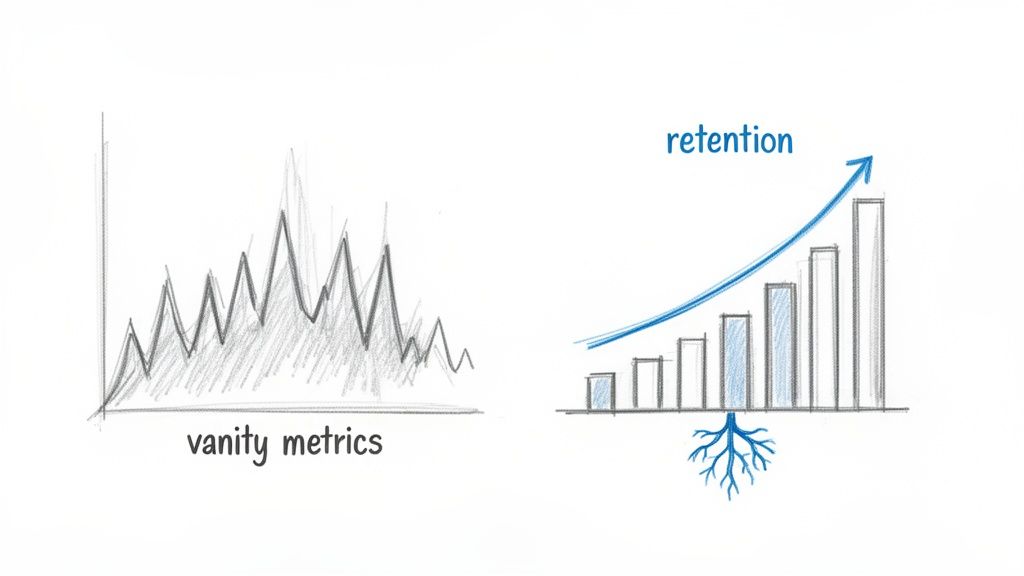
It’s tempting to chase those flashy "vanity metrics"—new sign-ups, daily active users, website traffic. They look great in a pitch deck, but they don't tell you if your business has a solid foundation. Real, sustainable growth comes from a much less glamorous, but far more powerful, source: customer retention.
Think of retention as the bedrock of a healthy subscription business. It’s the ultimate proof that your product is delivering real, ongoing value long after the initial excitement of a sale wears off. A high retention rate is a clear signal of strong product-market fit and a loyal customer base—the two ingredients you absolutely need for predictable, long-term revenue.
The Real Story Behind Your MRR
Just tracking top-line Monthly Recurring Revenue (MRR) can hide some ugly truths. An influx of new sales might temporarily boost your MRR, masking a leaky bucket where existing customers are quietly churning out. This is precisely why you have to get specific with your retention ratios.
These metrics cut through the noise. They help you see the difference between a one-off sales bump and genuine, sustainable business health. It’s about getting an honest look at your company’s stability.
When you start focusing on retention, your entire mindset shifts from "growth at all costs" to building lasting relationships and value. The financial impact is massive. Research has shown that a mere 5% increase in customer retention can boost profitability by anywhere from 25% to 95%. That's not just a statistic; it's a powerful argument for treating retention as your primary growth lever.
To give you a clearer picture before we dive into the formulas, here's a quick breakdown of the three key retention metrics we'll be covering.
The Three Key Retention Ratios at a Glance
| Retention Ratio Type | What It Measures | Key Question It Answers |
|---|---|---|
| Customer (Logo) Retention | The percentage of customers you keep over time. | Are our customers staying with us? |
| Revenue Retention (NRR & GRR) | The percentage of revenue you retain from existing customers. | Is our existing customer base becoming more or less valuable? |
| Cohort Retention | The retention of specific groups of customers over their lifecycle. | How does user behavior and loyalty change over time? |
Each of these ratios tells a different part of the story, and together they provide a comprehensive view of your business's health.
The Three Core Retention Ratios
To really get a handle on your business, you need to look at retention from a few different angles. Each ratio gives you a unique piece of the puzzle:
Customer Retention (Logo Retention): This is the most straightforward. It tells you how many of your customers stuck around. It answers the simple, vital question: "Are our customers staying with us?"
Revenue Retention (NRR & GRR): This one is all about the money. It tracks how much revenue you're keeping from your existing customer base, factoring in upgrades, downgrades, and churn. It answers: "Is our existing customer base becoming more or less valuable over time?"
Cohort Retention: This is where things get really insightful. You group customers by when they signed up and track their behavior over time. This helps you answer questions like: "Do customers who joined in Q1 behave differently than those who joined in Q3?"
By tracking these three pillars, you can move beyond simply reporting numbers and start making smart, strategic decisions that fuel real growth. Of course, understanding the numbers is one thing; improving them is another. To turn these insights into action, you'll want to explore some proven SaaS customer retention strategies to keep your customers happy and engaged.
Calculating Customer Retention (Logo Retention)
Before diving into the more complex flavors of retention, we have to start with the foundation: Customer Retention. You’ll often hear this called Logo Retention in the SaaS world, and it’s the most straightforward way to gauge your company's health.
At its core, this metric answers a simple question: "Are our customers sticking around?" It strips away all the noise from revenue changes—like upgrades, downgrades, or add-ons—and just counts the bodies. How many of the customers you had last month are still with you this month?
Think of it as the first line of defense against a leaky bucket. A high logo retention rate is a powerful signal that your product is delivering real, consistent value. If that number starts to drop, it’s an immediate red flag that something’s off with your product, onboarding, or support.
The Customer Retention Formula
The math here is refreshingly simple. You’re just comparing the number of customers you started a period with to the number of those same customers who were still around at the end. The key is to exclude any brand-new customers you signed up during that time.
Here's the formula:
Customer Retention Rate = ( (Customers at End of Period - New Customers Acquired) / Customers at Start of Period ) * 100
This calculation gives you a clean percentage representing customer loyalty and satisfaction. It's the direct inverse of your churn rate—two sides of the same coin. In fact, if you want to see how the other half lives, you can check out our deep dive on how to calculate churn rate.
A Practical Example
Let’s put this into practice with a fictional SaaS company, "SyncUp." We'll look at their numbers for the month of March.
- Customers at Start (March 1): SyncUp kicked off the month with 800 active customers.
- New Customers Acquired: Their sales and marketing teams had a good month, bringing in 100 new subscribers.
- Customers at End (March 31): When the month closed, their total customer count stood at 850.
Now, let's plug those numbers into the formula to find their true retention.
- First, we need to find out how many of the original 800 customers were left. We do this by subtracting the new customers from the final count: 850 (Ending) - 100 (New) = 750.
- Next, we divide this number by the starting customer count: 750 / 800 = 0.9375.
- Finally, we convert that decimal into a percentage: 0.9375 * 100 = 93.75%.
So, SyncUp’s customer retention rate for March was 93.75%. That's a solid number, suggesting their product is sticky and customers are happy.
Pulling the Data with SQL
If you're comfortable working with your database, you can automate this entire process with a bit of SQL. A few simple queries can give you all the raw numbers you need without any manual counting.
Here’s a basic set of queries you can adapt for your own subscriptions table. This example assumes you have columns like customer_id, start_date, and end_date.
-- Customers at the start of the period (e.g., March 1st, 2024) SELECT COUNT(DISTINCT customer_id) AS starting_customers FROM subscriptions WHERE start_date < '2024-03-01' AND (end_date IS NULL OR end_date >= '2024-03-01');
-- Customers at the end of the period (e.g., March 31st, 2024) SELECT COUNT(DISTINCT customer_id) AS ending_customers FROM subscriptions WHERE start_date < '2024-04-01' AND (end_date IS NULL OR end_date >= '2024-03-31');
-- New customers acquired during the period SELECT COUNT(DISTINCT customer_id) AS new_customers FROM subscriptions WHERE start_date >= '2024-03-01' AND start_date < '2024-04-01';
Running these snippets will give you the three key inputs for the retention formula, making it much easier to track this crucial metric consistently.
Getting a Handle on Net and Gross Revenue Retention
While counting customers gives you a headcount, the real story of your SaaS business’s health is written in dollars and cents. This is where we graduate from simple logo counts to the two most powerful financial metrics you can track: Gross Revenue Retention (GRR) and Net Revenue Retention (NRR).
These two numbers tell you exactly how much of your existing revenue you’re holding onto. More importantly, they reveal whether that revenue base is naturally growing or shrinking over time. Think of them as a direct line of sight into customer satisfaction, product stickiness, and your ability to grow accounts after the initial sale.
Gross Revenue Retention: Your Stability Metric
I like to think of Gross Revenue Retention (GRR) as a measure of your business's foundation. It calculates the percentage of revenue you’ve kept from your existing customers, but it only looks at the downside—revenue lost from churn and downgrades. Crucially, GRR intentionally ignores any new revenue you've generated from expansions or upsells.
GRR is your defensive game. It answers the question, "If we didn't land a single upgrade this month, how much of our starting revenue would we still have?" A high GRR, ideally north of 90% for most SaaS businesses, is a strong signal that your core product delivers on its promise and customers aren't rushing for the exits.
The formula is pretty straightforward:
GRR = ( (Starting MRR - Churned MRR - Downgrade MRR) / Starting MRR ) * 100
By the way, if you ever get tripped up on the nuances of financial terms, our guide on revenue vs. bookings is a great resource for clearing things up.
Net Revenue Retention: The Growth Engine
If GRR is your defense, then Net Revenue Retention (NRR) is your offense—your growth engine. It takes the GRR calculation and adds back the positive impact of expansion revenue from upsells, cross-sells, and add-ons.
NRR answers the single most important question for any subscription business: "Is our existing customer base, on its own, a source of growth?" This is the metric that gets investors excited because it points directly to efficient, compounding growth.
Here’s the formula for NRR:
NRR = ( (Starting MRR - Churned MRR - Downgrade MRR + Expansion MRR) / Starting MRR ) * 100
A healthy SaaS business should be aiming for an NRR over 100%. Hitting that magic number means your expansion revenue from happy, successful customers is more than making up for the revenue you lose from churn and downgrades.
Top-quartile SaaS companies often boast an NRR of 120% or more. This tells the world that the business has a powerful, self-sustaining growth loop baked right into its model.
Putting It All Together: A Practical Example
Let’s check back in with our fictional SaaS company, SyncUp, to see how these two metrics work together. Here are their numbers for March:
- Starting MRR (March 1): $100,000
- Churned MRR: $5,000 (from customers who cancelled)
- Downgrade MRR: $2,000 (from customers moving to cheaper plans)
- Expansion MRR: $12,000 (from customers upgrading or adding seats)
First, let's calculate their GRR.
- Total Revenue Lost: $5,000 (Churn) + $2,000 (Downgrade) = $7,000
- Revenue Retained (After Losses): $100,000 - $7,000 = $93,000
- Calculate the Percentage: ($93,000 / $100,000) * 100 = 93% GRR
SyncUp’s GRR of 93% is solid. It shows they have excellent revenue stability and a sticky product.
Now for the exciting part—their NRR.
- Start with Retained Revenue: We already know this is $93,000.
- Add Expansion Revenue: $93,000 + $12,000 = $105,000
- Calculate the Percentage: ($105,000 / $100,000) * 100 = 105% NRR
With an NRR of 105%, SyncUp isn't just retaining revenue; it's actively growing it without acquiring a single new customer. This is the hallmark of a healthy, scalable business.
Don't underestimate how critical a strong NRR is. According to ChartMogul's 2023 research, businesses with NRR over 100% grow at an impressive 43.6% annually, while those stuck below 60% barely scale at all. You can dive into more insights in their full SaaS retention report.
Using Cohort Analysis to Find Deeper Insights
Overall customer and revenue retention metrics are great for a quick health check. They give you a high-level view, but they only ever tell you what happened, not why. The problem with these aggregate numbers is they average out the behavior of all your customers, effectively hiding the critical trends that could be making or breaking your business.
To get to the real story, you need to go a layer deeper with cohort analysis.
A cohort is just a group of users who share a common characteristic. In the world of SaaS, we're usually talking about a time-based cohort—think "all customers who signed up in January 2024" or "everyone who joined the week after our big product launch."
By grouping customers this way, you can watch how they behave over their entire lifecycle. This segmented view is infinitely more powerful than a single, blended retention number. It lets you isolate the impact of specific events and see how different groups of customers stick around (or don't) over time.
Why Cohort Analysis Is a Game Changer
Instead of seeing a single, flat retention rate, cohort analysis might reveal that your January signups are incredibly loyal, while the group you acquired from a big marketing push in February is churning out at an alarming rate. You'd never spot that from a single, blended number.
This approach helps you answer the questions that actually matter:
- Did that big onboarding redesign we shipped last quarter actually make new users stick around longer?
- Are customers coming from our partnership channel more valuable in the long run than the ones from paid ads?
- Is our product getting stickier? Is retention improving with each new wave of signups?
Understanding these trends is everything. For instance, it’s a known benchmark that SaaS businesses with an Annual Contract Value (ACV) over $250k have a median Net Revenue Retention of 110%, while those with an ACV under $25k hover around 96%. Cohort analysis is what uncovers these kinds of variances, showing you how your strategy needs to adapt for different customer types. You can dig into more of this kind of data by checking out the SaaS Capital benchmarks.
Reading a Cohort Chart
A classic cohort retention chart usually looks like a triangle-shaped grid. Each row is a different cohort (e.g., "Jan 2024 Signups"), and the columns represent the time since they signed up (Month 0, Month 1, Month 2, and so on). The cells show the percentage of the original cohort that is still active in any given month.
The chart below gives a good visual feel for two key metrics—Gross and Net Revenue Retention—that you often see improve when you start acting on insights from cohort analysis.
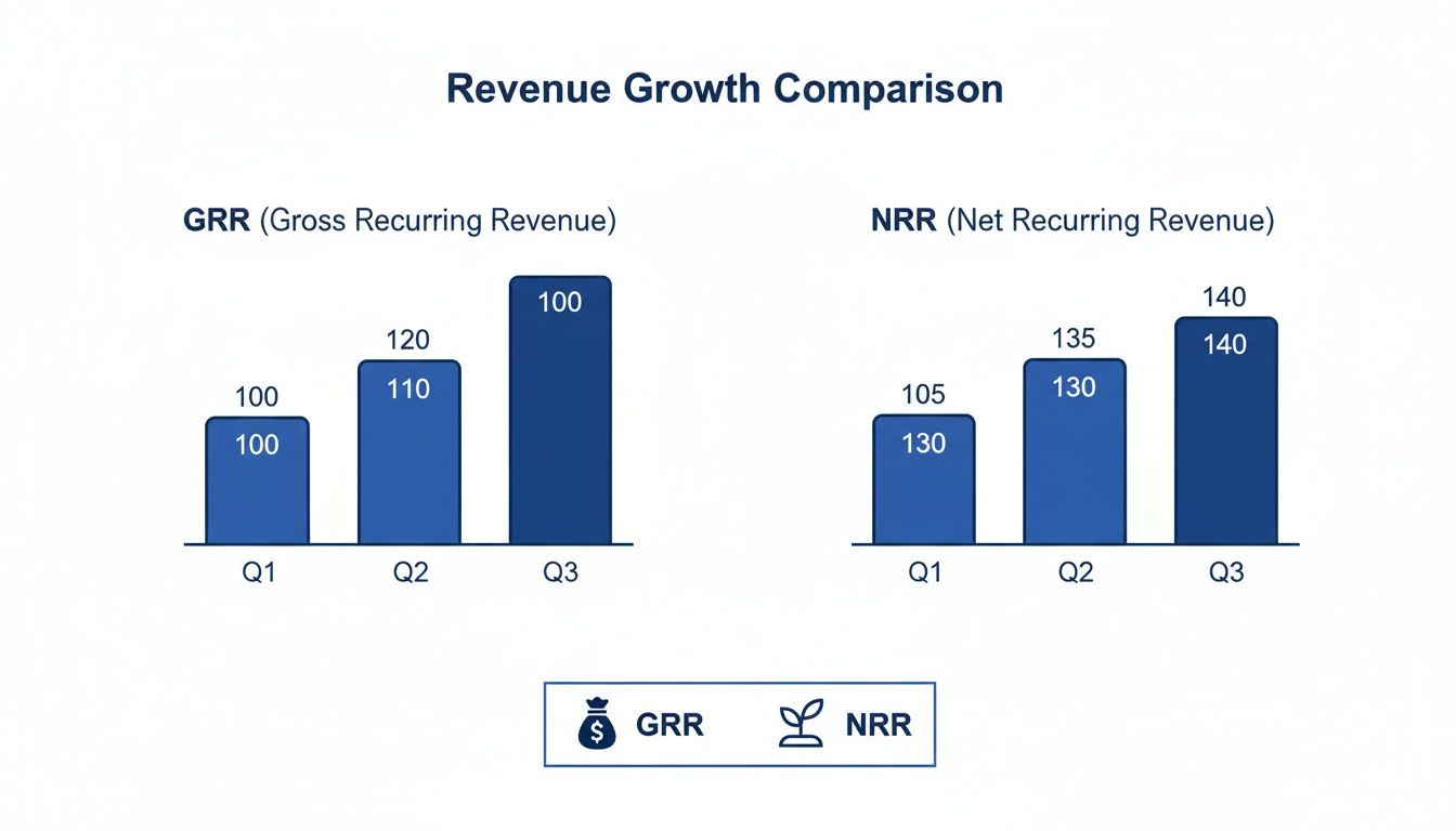
This visual is a great example of how strong Net Revenue Retention (NRR) can pull away from Gross Revenue Retention (GRR). That gap means you've got healthy expansion revenue coming from existing customers—a trend you can pinpoint to specific, high-performing cohorts.
The real magic happens when you scan down the columns. If you look at the "Month 3" column, for example, and see that the retention percentages are getting higher for more recent cohorts, that's a powerful signal that your product or onboarding improvements are actually working. If you want a more detailed walkthrough, we've put together a full guide on what is cohort analysis.
How to Structure Your Data for Cohort Analysis
Ready to build your own? The first step is getting your customer data organized correctly. You can get started with a simple spreadsheet.
- Export Your Data: Pull a list of all your active customers from your payment processor like Stripe. Make sure you have their
customer_idandsubscription_start_date. - Assign Cohorts: Create a new column called "Cohort Month." For each customer, use their start date to assign them to a cohort (e.g., "2024-01").
- Track Monthly Activity: Now, add columns for each month following your first cohort. For every customer, you'll mark whether they were active that month, often with a simple 1 for active and 0 for churned.
- Calculate Percentages: Finally, for each cohort row, just divide the number of active users in a given month by the total number of users who started in that cohort. That gives you your retention percentage for that month.
If you're comfortable with databases, a SQL query can generate this grid much faster and save you a ton of manual work. Pivoting the data this way is far more scalable and less prone to human error as your customer base grows.
Automating Your Retention Metrics with Stripe
Crunching numbers in spreadsheets is a fantastic way to get started. Honestly, it’s how most of us first get a handle on our retention. But as your business scales, that manual process quickly becomes unsustainable. You need to shift from looking in the rearview mirror to seeing what's coming up ahead, and that's where your Stripe account becomes a goldmine.
The real trick to leveling up is enriching your Stripe data. Using Stripe’s subscription metadata, you can tag customers with all sorts of useful attributes. This opens the door to segmentation that would be a nightmare to manage by hand.
Just think about the possibilities. You could start tagging customers by:
- Acquisition Channel: Are customers from paid search stickier than those from organic content?
- User Persona: Do your enterprise users retain better than your SMB clients?
- Onboarding Completion: What's the retention difference between users who finished the setup wizard and those who didn't?
Suddenly, your Stripe account isn't just for billing—it's a powerful analytical database. And because this data lives right where transactions happen, you can also connect it to services that tackle specific churn drivers, like a Stripe-integrated dispute resolution tool to handle payment issues before they cause cancellations.
Moving From Data to Action
Tagging is a huge step, but the real magic happens when you connect your Stripe account to a modern retention platform. Tools like LowChurn are designed to do all the heavy lifting for you, automating how you calculate retention ratio and serving up insights in real-time.
Instead of manually exporting CSVs and wrestling with formulas, you just connect your Stripe account. In a few clicks, the system starts turning raw subscription events into dynamic dashboards. You get a clear view of everything from Net Revenue Retention (NRR) and Gross Revenue Retention (GRR) right down to the health of individual customers.
This shift to automation turns your retention data from a historical report into a living, breathing tool. It’s the difference between seeing you lost a customer last month and getting an alert that a high-value account is at risk of churning next week.
The Power of Predictive Analytics
The best platforms don't just tell you what happened—they tell you what's about to happen. By combining your Stripe subscription data with signals from how customers are actually using your product, they can predict churn before it even occurs. This is a complete game-changer.
Your Stripe data is valuable, but it becomes exponentially more powerful when layered with product usage patterns. A platform that analyzes both can spot at-risk accounts 7-30 days in advance with over 85% prediction accuracy. This lets your team intervene precisely when it matters most, focusing their energy on the customers who need a little help right now. You can see exactly how these predictive models work on LowChurn.io.
Common Questions About Calculating Retention
Okay, so we've covered the 'how.' But knowing the formulas is one thing; applying them in the real world often brings up some thorny questions. Founders I talk to always hit a few common sticking points when they start digging into their retention numbers for the first time.
Let's clear those up right now.
What’s a “Good” Retention Rate Anyway?
This is the million-dollar question, and the honest answer is: it depends. Benchmarks shift based on your industry, who you sell to (SMB vs. Enterprise), and how mature your company is. But there are some solid goalposts to aim for.
For customer retention (sometimes called logo retention), a healthy SaaS business should be aiming for 90% or higher annually.
When it comes to Net Revenue Retention (NRR), the bar is even higher. Your target should be north of 100%. Crossing that threshold is a huge milestone—it means the revenue you're adding from existing customers (upsells, cross-sells, and expansions) is greater than the revenue you're losing from churn and downgrades. Your business is growing even without adding a single new customer.
If you're an early-stage startup, don't panic if your numbers aren't there yet. The most critical thing isn't hitting some magic number on day one. It's about establishing a baseline and making sure that trend line is moving up and to the right, month after month.
How Often Should I Be Looking at This?
For almost every subscription company, a monthly cadence is the way to go.
Calculating your retention metrics monthly gives you a tight enough feedback loop to see what’s working and what isn't. You can spot a negative trend before it snowballs or see the positive impact of a new feature you just shipped. It's also the standard for reporting critical metrics like MRR churn and NRR in board updates and investor reports.
Do I Need a Data Team to Do This?
Absolutely not. You don't need to be a SQL wizard to get started.
In the early days, you can get surprisingly far by exporting your subscription data from a platform like Stripe directly into a spreadsheet. A bit of manual work in Google Sheets or Excel—counting customers and summing up MRR for different time periods—can get you the baseline numbers you need.
But here’s the reality check: as you scale, this manual process becomes a huge time sink and is prone to human error. This is exactly why automated tools exist. They plug directly into your payment processor, do all the heavy lifting for you, and serve up the insights on a clean dashboard. No code, no spreadsheets, no headaches.
Ready to stop wrestling with spreadsheets and get automated, real-time retention insights? LowChurn connects to your Stripe account in minutes, providing AI-powered churn prediction and actionable health scores to help you protect your MRR. See how it works at LowChurn.com.